 Become a PowerPoint Guru by Dave Tracy
Learn the methodologies, frameworks, and tricks used by Management Consultants to create executive presentations in the business world.

 Become a PowerPoint Guru by Dave Tracy
A diamond diagram or a segment diagram is a very useful and flexible diagram. You can use them to illustrate anything that has multiple contributing components. The powerpointing technique taught in this tutorial is a great one to have in your growing PowerPoint diagramming skill set.
Here are some examples of situations that can be intuitively portrayed using diamond diagrams:
Now, there’s an incredibly easy way to create a Diamond Diagram in PowerPoint!
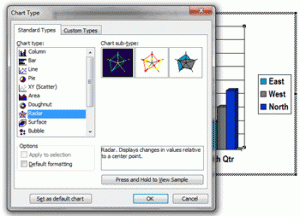
First, create a chart in PowerPoint and change the ‘Chart Type’ to ‘Radar Chart.’

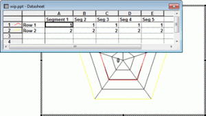
Next, modify the chart values. First, only leave 2 rows of data. Then, create as many columns as you would like segments. In our example, we will create a diamond with 5 segments. For the first row, set all the values to 1. For the second, set all the values to 2. UPDATE – The screenshot below is from PowerPoint 2003. For PowerPoint 2007 and 2010, the datasheet format is vertical–not horizontal (like you see in the image below). Therefore, you must input your values vertically (i.e. 1s and 2s in the same columns, not rows)

Next, change the line color for both of the data lines to black. Then, format the chart such that you remove the axis labels and set both the major and minor units to 1.
Your chart should now look like this. We pretty much have it.

I’m going to do some formatting, including replacing the inner section with a Pentagon AutoShape.
There we have it — a quick and easy powerpointing trick to create a Diamond or Segment Diagram using Radar Charts in PowerPoint.
Here are a couple more Diamond Diagrams with a different number of sides:
You can download the above slides from LearnPPT @ http://learnppt.com/downloads/diamonds/
If you are looking a larger variety of Segment Powerpoint templates, pre-built and ready to use, check out the Relationship, Segment, and Network Diagrams PowerPoint Pack:
http://learnppt.com/powerpoint/13_Relationship%2C-Segment%2C-%26-Network-Diagrams.php
Also, you can download a free PowerPoint plugin called Flevy Tools that creates commonly used consulting diagrams here: http://flevy.com/powerpoint-plugin. Flevy Tools allows you to dynamically generate Gantt Charts, Harvey Ball diagrams, approach diagrams, and other diagrams. For the time being, it’s a completely free download.
Questions, thoughts, concerns? Go to my site (learnppt.com) and shoot me an email.
For pre-made PowerPoint diagrams used in business presentations and other powerpointing needs, browse our library here: learnppt.com/powerpoint/. These diagrams were professionally designed by management consultants. Give your presentations the look and feel of a final product made by McKinsey, BCG, Bain, Booz Allen, Deloitte, or any of the top consulting firms.
Error: Twitter did not respond. Please wait a few minutes and refresh this page.
Thank you for sharing your info. I truly appreciate your efforts and I am waiting for your further write ups thank you once
again.