 Become a PowerPoint Guru by Dave Tracy
Learn the methodologies, frameworks, and tricks used by Management Consultants to create executive presentations in the business world.
Become a PowerPoint Guru by Dave Tracy
A couple more days and we’re done with 2010. Hope everyone has had a memorable and successful year.
This year marked the launch of both this blog and its parent PowerPoint resource site, Learn PowerPoint. This blog post is a recap of all free ppt downloads that have been made available through both of these sources.
Enjoy!
1-19. Free PowerPoint Templates
In 2010, we created 19 PowerPoint templates made available for free downloads. These have been our most downloaded free PowerPoints and span across a wide array of industries, including medical, technology, and business, to name a few.
Become a PowerPoint Guru book support materials
Become a PowerPoint Guru is a guide around creating effective business presentations using techniques and methodologies developed by consulting firms, like McKinsey, BCG, and Bain. The focus is very similar to that of this blog, e.g. powerpointing tricks, slide design, PowerPoint chart usages, etc.
Miscellaneous PowerPoint Diagrams and PowerPoint Templates
The links below are to pre-built PowerPoints that have largely been created in supported of our blog posts, many from our powerpointing tutorials.
22. Marketing Strategy PowerPoint Templates
Download – http://learnppt.com/downloads/3prongstrategy/
Tutorial – http://powerpointing-templates.com/2010/07/slide-from-scratch-3-prong-marketing-strategy/
23. Funnel Diagrams in PowerPoint
Download – http://learnppt.com/downloads/funnel_diagrams/
Tutorial – http://powerpointing-templates.com/2010/07/how-to-create-a-funnel-diagram-in-powerpoint/
24. Project Charter PowerPoint Template
Download – http://learnppt.com/downloads/project_charter/
Tutorial – http://powerpointing-templates.com/2010/11/the-blueprint-for-projects-success-a-project-charter/
25. PowerPoint Waterfall Chart Diagrams
Download – http://learnppt.com/downloads/waterfallcharts/
Tutorial – http://powerpointing-templates.com/2010/12/powerpointing-how-to-create-a-waterfall-chart-in-powerpoint/
26. Consulting Presentation Framework Template
Download – http://learnppt.com/downloads/sampletemplate/
Tutorial – http://ezinearticles.com/?The-Management-Consulting-Presentation-Framework&id=4423363
Expect more free PowerPoint diagrams and templates to come in 2011. Thanks for reading!
Questions, thoughts, concerns? Go to my site (learnppt.com) and shoot me an email.
For pre-made PowerPoint diagrams used in business presentations and other powerpointing needs, browse our library here: learnppt.com/powerpoint/. These diagrams were professionally designed by management consultants. Give your presentations the look and feel of a final product made by McKinsey, BCG, Bain, Booz Allen, Deloitte, or any of the top consulting firms.
The Waterfall Chart is one of the most effective and intuitive ways to illustrate change. It shows the total change, along with a breakdown of the individual components that have driven this change. Typically, it is used to represent a financial change — e.g. YoY changes in sales.
WaterFall Charts aren’t part of PowerPoint default selection of Chart Types. However, we can easily create one using a Stacked Column Chart.
Here’s how.
Start with create a generic chart in PowerPoint. Add enough data points and label them to your needs. In the example below, we’ll create a Waterfall Chart showing YoY Sales Growth. Observe the x-axis labels. ‘A,’ ‘B,’ and ‘C’ will later be our component bars.

Next, we want to make some quick adjustments to this chart. Change the ‘Chart Type’ to ‘Stacked Column.’
Also, adjust the ‘Gap width’ between the bars to be minimal (e.g. 10). Note that ‘Gap width’ is found under the ‘Options’ tab within the ‘Format Data Series’ window.
Remove one of the data sets, so we are only left with 2 stacked columns.

Now, to create the “waterfall” illusion, color the lower/bottom column with “no fill.” This lower column will determine how elevated the bar is from the x-axis.
Adjust your numbers as needed to create your Waterfall Diagram. I recommend removing the extraneous chart features, as well, e.g. grid lines, legend, etc.

I like to ungroup my chart, so I have more flexibility and control over the look and feel. Oftentimes, different colored bars are used and dashed lines are added to accentuate the change.

Here’s a fancier example.

You can download all the PowerPoint Waterfall Charts used in this PowerPointing tutorial from learnPPT:
http://learnppt.com/downloads/waterfallcharts/
To learn more about different types of charts, a very comprehensive resource is the Become a PowerPoint Guru book. It details and explains appropriate chart usage across the wide array of different types of data composition (e.g. item comparison, time series, frequency, correlation, etc.).
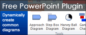
You can also download a free PowerPoint plugin called Flevy Tools that creates commonly used consulting diagrams here: http://flevy.com/powerpoint-plugin. Flevy Tools allows you to dynamically generate Gantt Charts, Harvey Ball diagrams, approach diagrams, and other diagrams. For the time being, it’s a completely free download.
Questions, thoughts, concerns? Go to my site (learnppt.com) and shoot me an email.
For pre-made PowerPoint diagrams used in business presentations and other powerpointing needs, browse our library here: learnppt.com/powerpoint/. These diagrams were professionally designed by management consultants. Give your presentations the look and feel of a final product made by McKinsey, BCG, Bain, Booz Allen, Deloitte, or any of the top consulting firms.
To learn more about different types of charts, a very
comprehensive resource is my the Become a PowerPoint Guru book.
It details chart uses across the wide array of different types
of data composition (e.g. item comparison, time series,
frequency, correlation, etc.).
Strategy in business is about winning and so, any successful business needs to have a well defined, executable strategy. Unsurprisingly, from both sales trends and customer feedback, at learnppt.com, we have found ourselves adding more and more products around this topic of business strategy.
This weekend, I took the time to compile all of our toolkits and frameworks related to business and strategy. Browse it here:
Business Strategy
Some of the topics discussed you will find include Growth Strategy, Marketing Strategy, and Management Strategy.
Our most recent PowerPoint in this domain teaches you how organizations can inject Creative Thinking into their Strategy Development processes:
Creative Thinking in Strategy Development
This document discusses the 3 enablers to creativity in strategy formulation:
Got a request in PowerPoint product of blog post topic? Leave a comment or shoot me an email.
Cheers!
Read my guest blog post at Kathy Reiffenstein’s blog, “Professionally Speaking…”
A Different Kind of Presentation
http://andnowpresenting.typepad.com/professionally_speaking/2010/12/a-different-kind-of-powerpoint-presentation.html
This article compares 2 types of presentations: the presentation meant as a work product versus the presentation meant to accompany a live speaking event.
Kathy Reiffenstein’s site (And Now Presenting) and blog (Professionally Speaking…) are great resources for developing the skills needed to be a confident and persuasive speaker.
—–
Questions, thoughts, concerns? Go to my site (learnppt.com) and shoot me an email.
For pre-made PowerPoint diagrams used in business presentations, browse our library here: learnppt.com/powerpoint/. These diagrams were professionally designed by management consultants. Give your presentations the look and feel of a final product made by McKinsey, BCG, Bain, Booz Allen, Deloitte, or any of the top consulting firms.
This is the second tutorial in the “Slide from Scratch” series. In the first, we walked through an example of creating a 3-Prong Marketing Strategy on a PowerPoint slide.
In evaluating any business function, creating process flows is an inevitable task. I’m sure you have had to create your fair share of process flows in the past.
The big problem with process flow diagrams is that they often grow to become overly-complicated and therefore, very difficult to interpret. There are too many lines going everywhere. Lines are criss crossing (very confusing!). Boxes aren’t aligned nor similarly sized (creates misdirection around importance of step).

Okay, let’s begin.
The Premise
You need to create a slide illustrating a high-level billing process. The process begins with the system-triggered invoice generation and ends with a customer service rep resolving a billing inquiry.
Slide Design
These are the simple steps I follow when constructing a process flow from scratch.
Step 1. Swim Lanes
The first step is to define your swim lanes, which are horizontal cross sections of your process flow corresponding to distinct groups that touch the process. Swim lanes add structure to your flow and are easy for people to understand.
I like to break process flows into 3 swim lanes:
I create my swim lanes using a table in PowerPoint.

Step 2. Add your Steps
Each step is represented with a box. There are number of standard process flow shapes. There’s no need to use the standard shapes. Why? Simply, most people don’t know what the standard shapes anyway–and so, using all the official, standard shapes may confuse your audience. Your goal is to create a process flow diagram that is very intuitive for your audience to understand and digest.
In fact, I recommend using icons that are non-standard, but intuitive, such as the ‘person’ icon to manual nature of an activity. There are 4 primary shapes/icons that I like to use, as shown in the picture below.

At learnppt.com, we’ve compiled a collection of People & Process Icons that you can use in your process flows.
So, in this step, add all your boxes. Structure the flow of your steps from the left-to-right, top-to-bottom. Don’t connect anything yet, as you will likely need to re-arrange and re-size your boxes to ensure they all fit on your slide in an easily readable manner.
I like to also add a box on the top right of the slide indicating the frequency of the process (e.g. daily, weekly, or monthly).

Step 3. Add your lines
This is very important — Use the AutoShape Elbow Arrow Connectors to connect your shapes. Connectors ensure your lines are straight and connected to the centers of shapes. Most importantly, when you move around boxes, your Connectors remain in tact. This saves a ton of time as you go through multiple iterations of your process flow.

Sometimes, you Connector won’t connect to the part of the shape you would like it to. There’s an easy work around to this. Create a small box to use as your proxy end connection point. I.e., connect your Connector to this small box and move this box to where you would like the Connector to go. Then, make the small box disappear by removing its fill color.
Avoid criss crossing at all costs. If you have a situation where this is impossible, then replace one of the Connector AutoShapes with a Curve (line) AutoShape.
Now, here’s our final product with all the lines added. You can download this slide/example here.

Add a couple embellishments, and here’s a slightly more refined version.

For more information related to process analysis and optimization, check out the Cost Reduction Toolkit. This Toolkit takes a detailed look at process improvements across the entire Value Chain of a company (as defined by strategist Michael Porter [http://en.wikipedia.org/wiki/Value_chain]). Here are other various resources you may be interested in:
You can download a free PowerPoint plugin called Flevy Tools that creates commonly used consulting diagrams here: http://flevy.com/powerpoint-plugin. Flevy Tools allows you to dynamically generate Gantt Charts, Harvey Ball diagrams, approach diagrams, and other diagrams. For the time being, it’s a completely free download.
Questions, thoughts, concerns? Go to my site (learnppt.com) and shoot me an email. On my site, you will find information about my recent eBook, Become a PowerPoint Guru, which teaches how to create effective business presentations (from structuring your story to designing your diagrams).
For pre-made PowerPoint diagrams used in business presentations, browse Flevy’s library here: https://flevy.com/function/PowerPoint-Templates-ppt. These diagrams were professionally designed by management consultants. Give your presentations the look and feel of a final product made by McKinsey, BCG, Bain, Booz Allen, Deloitte, or any of the top consulting firms.
Whether this is your first time stumbling across here or you’re a long time subscriber, thank you for reading my blog! Via comment or email, I always appreciate any feedback you have on what I post. I want to make sure any articles I post are relevant to my readers’ interests and that you find it both insightful and useful.
Since its launch (earlier this year), this blog has been the largest contributor of traffic referral to my PowerPoint products site, www.learnppt.com. I’ve received more hits from this blog than from Google and from my numerous Adword campaigns.
As a token of my appreciation, here is an exclusive coupon for 25% off at learnppt.com. The coupon applies to both the eBook and all the PowerPoint products (e.g. diagram packs, business frameworks, icon packs).
Coupon Link - http://learnppt.com/powerpoint/?promo=pptblog112010
BTW, there is a limited number of times this coupon code can be used before all the coupons are used up. At that time, I will try to update this post with a notification that this promotion has ended.
In any corporate engagement, it is invaluable to have clearly defined Project Charter. This charter helps provide focus and direction. It is the team’s blueprint for success!
The Project Charter has 5 primary objectives:
To achieve these goals, your typical Charter consists 8 areas:
A PowerPoint template of a Project Charter is displayed below. It is created by piecing together tables in PowerPoint. Remember, to resize table edges to the pixel, hold down the ALT key as you drag the edge.
For your inconvenience, you can also download this template from learnppt (http://learnppt.com/downloads/project_charter/).

Along with the Charter, there is usually a detailed Gantt chart that breaks down the Key Activities section of the Charter. The Gantt chart adds a timing component to each activity and offers a visual illustrating dependencies across activities and work streams. We have PowerPoint Diagrams Pack with various Gantt charts, calendars, meeting schedules, and other timeline diagrams at learnppt.com as well:
http://learnppt.com/powerpoint/23_Gantt-Charts%2C-Schedules%2C-and-Calendars.php
You can download a free PowerPoint plugin called Flevy Tools that creates Gantt charts, among other commonly used project management diagrams here: http://flevy.com/powerpoint-plugin. For the time being, it’s a completely free download.
Questions, thoughts, concerns? Go to my site (learnppt.com) and shoot me an email. On my site, you will find information about my recent eBook, Become a PowerPoint Guru, which teaches how to create effective business presentations (from structuring your story to designing your diagrams).
For pre-made PowerPoint diagrams used in business presentations, browse our library here: learnppt.com/powerpoint/. These diagrams were professionally designed by management consultants. Give your presentations the look and feel of a final product made by McKinsey, BCG, Bain, Booz Allen, Deloitte, or any of the top consulting firms.
The “Crawl Walk Run” approach is a great way for executives to frame and communicate change. This is particularly useful and most relevant to organizations growing from mid-size to enterprise.
During this transition, organizations need to create scalable processes, implement enterprise-wide systems, and potentially redefine their organizational structure. When faced with a lot of changes, it is important to prioritize them in a way that an organization can understand and execute against.
To do this, executives often structure changes under the Crawl Walk Run framework, where
As one would suspect, there are standard Crawl Walk Run diagrams used in PowerPoint presentations. On an initial slide, the Crawl Walk Run framework is presented with a high level descriptions capturing each of the Crawl, Walk, and Run stages. Then, successive slides dive deeper into each stage, breaking down the specific changes and target time frames for completion.

You can find Crawl Walk Run diagrams and templates at LearnPPT.
http://learnppt.com/powerpoint/21_MiniPack—Crawl-Walk-Run.php
There are also many variations to this rudimentary framework to illustrate different levels of change and progress, including:
This article was written by David Tracy.
Questions, thoughts, concerns? Go to my site (learnppt.com) and shoot me an email.
For pre-made PowerPoint diagrams used in business presentations, browse our library here: learnppt.com/powerpoint/. These diagrams were professionally designed by management consultants. Give your presentations the look and feel of a final product made by McKinsey, BCG, Bain, Booz Allen, Deloitte, or any of the top consulting firms.
Creating a linear approach with a distinct start and end is simple. Just piece together a number of chevrons. But, how about a circular approach PowerPoint diagram?
There are a number of ways to do this in PowerPoint. I’ll teach you the easiest method in this PowerPoint tutorial.
First, let’s gather the shapes. To create a simple circular approach diagram, you need at least 4 shapes.
See the diagram below.

Now, let’s piece the shapes together to form the PowerPoint diagram. See the final creation below to visualize how the pieces fit together. Remember, to resize a shape to the pixel, hold down the ALT key.

Note how the line is used to cover up the base edge of the arrow AutoShape. To create additional segments in your diagram, just take the arrow+line (i.e. shapes 3 and 4). Group them, replicate, rotate, and re-position. Simple as that.
The downside to this method of creating a circular approach is you cannot highlight a particular segment with a different color. On learnppt.com, we have a full PowerPoint Diagrams Pack around Circular Approach and Force Diagrams (http://learnppt.com/powerpoint/6_Circular-Approaches-and-Force-Diagrams.php).
Here are some fancier circular approach diagrams.

Questions, thoughts, concerns? Go to my site (learnppt.com) and shoot me an email.
You can download a free PowerPoint plugin called Flevy Tools that creates commonly used consulting diagrams here: http://flevy.com/powerpoint-plugin. Flevy Tools allows you to dynamically generate Gantt Charts, Harvey Ball diagrams, approach diagrams, and other diagrams. For the time being, it’s a completely free download.
For pre-made PowerPoint diagrams used in business presentations, browse our library here: learnppt.com/powerpoint/. These diagrams were professionally designed by management consultants. Give your presentations the look and feel of a final product made by McKinsey, BCG, Bain, Booz Allen, Deloitte, or any of the top consulting firms.
Recently, I had the pleasure of being interviewed by Geetesh Bajaj at Indezine, where we discussed my PowerPoint book Become a PowerPoint Guru.
You can read the full interview here:
http://blog.indezine.com/2010/07/become-powerpoint-guru-conversation.html
Indezine
http://www.indezine.com/
Indezine is a leading online resource for PowerPoint users. Check it out. You can find articles, tutorials, and templates.
—–
Questions, thoughts, concerns? Go to my site (learnppt.com) and shoot me an email.
For pre-made PowerPoint diagrams used in business presentations, browse our library here: learnppt.com/powerpoint/. These diagrams were professionally designed by management consultants. Give your presentations the look and feel of a final product made by McKinsey, BCG, Bain, Booz Allen, Deloitte, or any of the top consulting firms.