 Become a PowerPoint Guru by Dave Tracy
Learn the methodologies, frameworks, and tricks used by Management Consultants to create executive presentations in the business world.
Become a PowerPoint Guru by Dave Tracy
In this example, we will build a set of slides that capture a process optimization initiative. The slides will be following the Consulting Presentation Framework, where we start the slide with a Headline message and close with the Bumper. The bumper captures the key takeaway or added insight of the slide.
The Premise
Here’s our hypothetical situation. After evaluating financial ratios and comparables, your company realizes its operations are very inefficient. In particular, management recognizes that its core financial processes are poorly executed in their current states. They have asked you and your team to analyze and optimize the processes of forecasting, accruing, and financial reporting. These three processes are sequential.
The purpose of the business presentation we will create is to capture the results of your process optimization initiative. (As an aside, process optimization is a cost reduction effort.) For each process, we will provide an overview, lay out the inputs and outputs, as well as draw out the proposed future state process flow. This presentation should act as a report management can print out, review, as well as distribute to others in the organization.
The Thought Process
To begin, we should have a vision in mind for a diagram that is both intuitive and aesthetically appealing. Since we are looking at 3 sequential processes that repeat on a monthly, ongoing basis, let us create a circular approach diagram. This is the diagram I am referring to:

Remember how to create that? If not, just take a refresher at this tutorial: Circular Approach PowerPoint Diagram. The only downside this method of constructing circular approach diagrams is that you can’t individually select and format the chevrons. You won’t have that problem with the Circular Approach Diagrams here though. This is a great pack of editable PowerPoint diagrams that includes both Circular Approach and Force Diagrams (PowerPoint Templates).
Now, slap this diagram onto a slide and add in some text. For each segment, we want to add a label (e.g. “Forecasting”) and a number to illustrate proper sequence.

We would like to add more clarity around what each process represents. To do this, we can add this explanatory text to the right of the diagram. At this point, we can also complete the slide, adding in our Header and Bumper texts. Let’s see how the final slide looks.

Again, the text content used is illustrative and largely for purposes to fill the slide. The “bumper” text (see Consulting Presentation Framework section for a refresher on this term) captures an insight that is not obvious from the rest of the slide.
One other important observation to make is that this diagram is also very simple. Because of its simplicity, it will make a good “tracker” to be used on future slides. A tracker is an icon diagram used on multiple slides to help the audience track along the progress of the presentation. The tracker is always a smaller version of a diagram introduced earlier in the presentation. It is usually located on the top-right portion of the slide. Hard to envisage? You’ll see soon enough.
Introducing the SIPOC Framework
SIPOC is a tool used in Six Sigma to evaluated processes and identify touch points between process steps. It is an acronym, standing for Suppliers, Inputs, Process, Outputs, and Customers. You can learn more about the SIPOC framework at iSixSigma.com and OpensourceSixSigma.com. SIPOC also provides a great PowerPoint template for breaking down a process.
We will create an initial slide to introduce the SIPOC concept and diagram. We will begin by creating a chevron-diagram, where each chevron AutoShape represents one of the components of S-I-P-O-C. Since the focus is on the “process” of SIPOC, we will draw special attention to that in our diagram. Let’s put these initials onto a slide.

For those unfamiliar with SIPOC, we will need to explain what each letter represents. We can do this by adding downward pointing chevron AutoShapes above the current diagram. Let’s take a look.

Next, let’s add more clarity around each of the terms. What does it mean to be a supplier? How about a customer? These basic questions should be addressed on a high-level, minimally. We will do so using arrows and circles below the chevrons.

Finally, we should explain the benefits and usefulness of SIPOC analysis. This can be done at the bottom of our diagram, resulting in our completed slide. Note how the flow of the diagram it top-down. In creating a larger diagram or visual, such as this one, it is best to always have a flow of information. This helps guide the audience.

Creating the Process-specific Slides
We will create a set of slides for each of the 3 processes. Within the set, the first slide will be the “Process Narrative.” This slide presents an overview of the process, explaining what it is, what are the issues and inefficiencies, and the recommended improvements to the existing process.
The next slide will be our SIPOC analysis for the process. This will break down the process in a more structure format.
The final slide will be the proposed future state process flow. This slide will contain a process flow diagram, illustrating each of the process steps or activities, how they sequence, and who or what performs each step.
We will be using the “tracker” icon across all our slides. This tracker will be based off the circular approach diagram created in the overview slide. Let’s see how the tracker will look on the Process Narrative slide for the Forecasting process.

Since our narrative is essentially all text, all we need is a text box. Instead of using a plain text box, in our example, we will use a table with 2 rows. The top row will be our heading. The second row will contain the bulk of our content. Since our example is just for illustrative purposes, I won’t bother filling up this slide with text.

Now, we will create the SIPOC slide. As the audience is already familiar with the S-I-P-O-C chevron diagram, we will re-use it here. Let’s copy and paste this diagram to the top of the body. Under it, we will create a table with 2 primary rows. The first row will explain the purpose of the element. The second row tabulates specific examples, as they relate to the forecasting process.

Note how the entire bottom half of the diagram was created using a table. To create the vertically-oriented text, i.e. “Examples” and “Purpose,” I created a text box and rotated it 90 degrees. Now, let’s fill out the table with text.

Note that our examples are listed using indented bullets. I also like to create paragraph spacing between the bullets. This gives everything a clean, organized look.
Lastly, we will create the future state process flow slide. Remember how to create a process flow in PowerPoint? If not, take a look at this Slide from Scratch tutorial: A Billing/Invoicing Process Flow.
Remember, I like to organize my process flows with simple, high-level swim lanes. Depending on the nature of your process, you are free to define your swim lanes however you’d like. In our example, we will define them as “Financial System/IT,” “Finance Team (Manual),” “Corporate.” I will create the swim lanes using a table in PowerPoint. Here we go.

Time to lay out our process flow shapes. A process flow can be very complex. So, it is important to lay things out in a very organized way. Don’t bother putting in any lines yet. Do that after you’re happy with the layout of all your shapes.

Once you’ve laid out your process steps, we can connect them using the Elbow Arrow Connector AutoShape to form the finalized process flow diagram.

A process flow diagram can be an overwhelming visual for your audience to digest. Therefore, you may want to highlight specific swim lanes and specific process steps. To highlight a swim lane, merely shade the background. This is easy to do, since our swim lanes were created using a table. To highlight specific steps, just use a call out boxes (which are AutoShapes). Let’s have a look.

There we go. If you’d like, you can further enhance your process flow diagrams with these specialized PowerPoint diagram packs:
Those are are our set of 3 slides for the Forecasting process. We just need to copy and paste these slides for the Accruing and Reporting sections. I will leave that exercise for you. Just remember to update the tracker diagram for these other processes. To make each process section more comprehensive, you can add in these additional slides: a current state process flow, a slide outlining key metrics and performance indicators, a slide tabulating process objectives, a slide listing assumptions used, and a slide capturing any outstanding questions.
You can download this full presentation (with the intermediate slides) here: Process Optimization Presentation ( http://learnppt.com/downloads/process-optimization/).
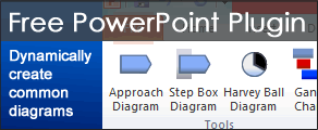
You can also download a free PowerPoint plugin called Flevy Tools that creates commonly used consulting diagrams: http://flevy.com/powerpoint-plugin. Flevy Tools allows you to dynamically generate Gantt Charts, Harvey Ball diagrams, approach diagrams, and other diagrams. For the time being, it’s a completely free download.
Questions, thoughts, concerns? Go to my site (learnppt.com) and shoot me an email. On my site, you will find information about my recent eBook, Become a PowerPoint Guru, which teaches how to create effective business presentations (from structuring your story to designing your diagrams).
For pre-made PowerPoint diagrams used in business presentations, browse our library here: learnppt.com/powerpoint/. These diagrams were professionally designed by management consultants. Give your presentations the look and feel of a final product made by McKinsey, BCG, Bain, Booz Allen, Deloitte, or any of the top consulting firms.