
 Become a PowerPoint Guru by Dave Tracy
Learn the methodologies, frameworks, and tricks used by Management Consultants to create executive presentations in the business world.
Become a PowerPoint Guru by Dave Tracy
Representation of lots of data in a visually meaningful and intuitive way can be a daunting task. In fact, there’s quite a science to it.
When representing multiple dimensions of data on a single diagram, consultants often rely on the 2×2. Not only is the 2×2 an incredibly flexible and powerful tool, it is also very easy to construct in PowerPoint. There are many well known frameworks based on this design. Perhaps the most famous is the BCG Matrix.
If you’re not sure what a 2×2 is, take a look below at BCG’s Growth Share Matrix (or check out this BCG Matrix PowerPoint document for more info).

A 2×2 diagram is simply a Cartesian graph divided into 4 equally sized quadrants. Circles are then plotted on the graph. Oftentimes, the upper-right quadrant is the ideal state (for the circles to fall in)—coined by Gartner Research, this quadrant is referred to as the “Magic Quadrant.”
The 2×2 can be used to represent up to 5 dimensions of data. Let’s break these dimensions down.
The First 2 Dimensions – X-Axis, Y-Axis
The first 2 dimensions are represented by the 2 axes. Simple enough.

It is customary for the increase in desirability to increase as you increase across each axis (i.e. upwards on the y-axis, towards the right on the a-axis). This results in the upper right quadrant becoming that “Magic Quadrant.” Likewise, the bottom-right is the quadrant no one wants to be in. It often has bleak names, like the “Dead Zone” or “Graveyard.” Note this is not the case for the Growth-Share Matrix.
The Next 2 Dimensions – Color and Size
The next 2 dimensions are represented by the circles’ colors and sizes. For color, it is not a continuous scale. You will usually use the color attribute to separate the circles into 2 or 3 specific categories. If your circles represent companies, your colors can be used to distinguish incumbent vs. new entrant; public vs. private; or domestic vs. international companies.
Although size is on a continuous scale, it is often difficult to gauge exact relative size. Therefore, it is best to include a large and small circle in your legend as points of reference. The size of the circle is often used to represent a relative dollar value. Examples include market size, size of opportunity, or annual sales. Remember that, in PowerPoint, you need to hold down the Shift key as you resize shapes to maintain its proportions.

The 5 Dimension – And Beyond?
The 5th dimension is represented by some direction given to the circles. On a single 2×2, this is represented by an arrow paired with each circle.

This sense of direction tells your audience where the entity is heading. It tells the story of future projections, market trends, and market dynamics. A great way to represent this is often with two 2x2s side by side. This allows your audience to immediately see which circles have remained constant through the years; which have declined; and which have improved their positions.

Do not try to illustrate changes in position using animation within PowerPoint. In fact, in general, animation is frowned upon. This is because 1) you will lose the effect on printout copies and 2) people will not see it if they are following along, but not in PowerPoint presentation mode.
It is not recommended to go beyond 5 dimensions. Otherwise, the slide will look too busy and often your audience won’t be able to retain the information very well. However, if you feel the need to, you can embed additional dimensions or layers of information by using different shapes (in addition to the circles), perhaps outlines capturing clusters, and meaningful callout boxes.
There is a lot more we can discuss around the 2×2. In fact, there are full business books written around this very concept. E.g. Lowy and Hood’s “The Power of the 2×2 Matrix.”
With that said, I hope this is enough food for fodder to get you started on your 2×2 PowerPoint diagramming needs. If you’re overly ambitious, you can also go for a 3×3 or bigger.
Here are some related resources:
Do you run a consulting firm? If so, take a look at this article, which discusses Why FlevyPro is a Must Have for Independent Consultants and Boutique Consultancies.
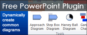
By the way, you can download a free PowerPoint plugin called Flevy Tools that creates commonly used consulting diagrams here: http://flevy.com/powerpoint-plugin. Flevy Tools allows you to dynamically generate Gantt Charts, Harvey Ball diagrams, approach diagrams, and other diagrams. For the time being, it’s a completely free download.
Questions, thoughts, concerns? Go to my site (learnppt.com) and shoot me an email.
For pre-made PowerPoint diagrams used in business presentations, browse our library here: learnppt.com/powerpoint/. These diagrams were professionally designed by management consultants. Give your presentations the look and feel of a final product made by McKinsey, BCG, Bain, Booz Allen, Deloitte, or any of the top consulting firms.


[...] Charts are perhaps a consultant’s best friend. These are simple and very intuitive visuals, often taking the form of either a 2×2 or [...]