Author Archives: Dave Tracy

The 5 Best KPI Management Tools and Resources for Performance

You already know KPIs matter. The harder question is where to find the right ones—and what to do with them once you have.

Every annual planning cycle, the same scene plays out in conference rooms around the world. A leadership team agrees that “we need better metrics.” Someone pulls together a spreadsheet of 40 or 50 KPIs cobbled from Google searches, competitor decks, and half-remembered conference talks. The list gets debated, trimmed, loaded into a dashboard tool, and reviewed enthusiastically for about 6 weeks—after which it quietly dies. By Q3, nobody can remember what half the metrics were supposed to tell them, and the executive team is back to making decisions on instinct.

The failure is rarely about discipline. It is almost always about infrastructure. Specifically, 3 gaps that most organizations never close: they lack a rigorous source for identifying and defining KPIs in the first place, they lack a strategic framework that connects metrics to business outcomes, and they default to a visualization tool before solving either of the first 2 problems. Buying a dashboard is the easy part. Knowing what belongs on it—and why—is where the real work lives.

This article covers 5 resources that address the full arc of KPI management, from metric selection through strategic integration to operational tracking. They are deliberately varied: a reference database, a consulting-frameworks library, and 3 software platforms calibrated to different levels of organizational scale and analytical ambition.

1. KPI Depot

Start here. Before you open a dashboard tool, before you debate which metrics belong on the CEO’s monthly report, start with KPI Depot.

KPI Depot maintains the largest structured database of corporate KPIs and benchmarks available anywhere—24,000+ KPIs and 34,000+ benchmark data points as of early 2025, with the collection expanding continuously. The coverage is unusually broad: 15 corporate functions (from finance and operations to legal, innovation management, and regulatory compliance) and more than 150 industries, including granular verticals like semiconductor manufacturing, theme parks, private equity, and electric vehicles.

But the real value is depth, not just breadth. Every KPI in the database is documented across 12 attributes — definition, formula, measurement approach, business insights, trend analysis, diagnostic questions, actionable improvement tips, visualization suggestions, risk warnings, recommended tools, integration points with other systems, and change impact (how movement in this KPI affects others). That level of documentation transforms a KPI from a label on a dashboard into something an analyst can actually implement, a manager can interrogate, and a consultant can present with confidence.

The benchmarks database deserves its own mention. Each data point carries full provenance: source publisher, methodology, sample size, geography, time period, company size, and a source excerpt for context. Benchmarks are compiled from consulting whitepapers, market research, SEC filings, government datasets, and academic publications. This is the kind of sourcing rigor that a Big 4 advisory team would apply to a benchmarking engagement — available as a subscription starting at $199 per year.

Clients include Accenture, EY, IBM, PepsiCo, Samsung, Dell, Vodafone, Honeywell, and Novo Nordisk. For strategy consultants, corporate planning teams, and PE-backed operators building scorecards from scratch, KPI Depot eliminates hundreds of hours of primary research. It also solves a subtler problem: it gives organizations a shared, externally validated reference point for what “good” looks like, which makes internal debates about targets significantly more productive.
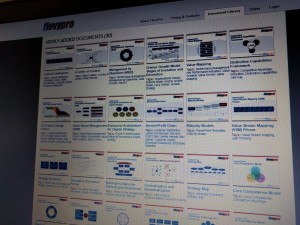
2. Flevy

KPI Depot tells you what to measure. Flevy tells you how to build the system that makes measurement drive action. The 2 are complementary, and using both is significantly more effective than using either alone.

Flevy is the largest online marketplace for consulting-quality business frameworks—more than 10,000 documents spanning strategy, operations, transformation, and management methodology, developed by practitioners with backgrounds at McKinsey, BCG, Bain, Deloitte, Accenture, and similar firms. It has served over 10,000 organizations in 130+ countries since 2012, and its materials are used by Fortune 100 companies alongside growth-stage firms that want to punch above their weight in strategic rigor.

Three Flevy categories are directly relevant to KPI management. The Performance Management library (60+ documents) covers Balanced Scorecard design, enterprise performance management architecture, performance maturity assessments, and scorecard-to-strategy linkage—the kind of structural work that determines whether KPIs actually influence decisions or merely decorate a report. The KPI-specific resources include curated, function-level KPI compilations (one Human Resources collection alone runs to 800+ metrics), along with practical guides on KPI selection pitfalls, maintenance principles, and lifecycle management. And the Objectives and Key Results (OKR) library provides the goal-setting methodology that companies from Google to mid-market SaaS firms have adopted to connect individual accountability to organizational priorities.

What separates Flevy from the blog posts and free templates that surface in a typical search is the consulting-engagement level of depth. A Flevy resource on KPI implementation doesn’t offer 5 bullet points and a Venn diagram. It walks through maturity models with stage-by-stage diagnostic criteria, common failure modes with remediation playbooks, and second-generation measurement approaches (like the Value Mapping framework) that address the documented shortcomings of older models like the original Balanced Scorecard. The materials are delivered as fully editable PowerPoint and Excel files—ready to be dropped into a client presentation or internal strategy review without reformatting.

If KPI Depot is the encyclopedia, Flevy is the engineering manual. Together, they give a performance management team everything it needs to design a measurement system that is strategically grounded, operationally rigorous, and built to last longer than 1 planning cycle.

3. Tableau

Selecting the right KPIs and embedding them in a strategic framework are necessary but not sufficient. At some point, the numbers need to live somewhere—and the quality of that “somewhere” determines whether KPI data gets used or ignored. Tableau, now part of the Salesforce ecosystem, is the tool of choice for organizations that want their KPI dashboards to do more than report status. They want to explore, drill down, and diagnose.

Tableau connects to essentially any data source a modern enterprise uses—cloud databases, ERP systems, CRMs, flat files, live APIs—and turns raw data into interactive visualizations through a drag-and-drop interface that, while powerful, does not require SQL fluency. The platform’s native analytical capabilities go well beyond simple bar charts and traffic lights. Heatmaps, scatter plots, trend overlays, statistical forecasting, and cohort comparisons are all standard features, which makes Tableau particularly well suited for organizations where the important question is not “are we hitting target?” but “what’s driving the variance, and which levers should we pull?”

The Salesforce integration creates a natural bridge for revenue-focused KPIs—pipeline velocity, win rates, customer acquisition cost, lifetime value—linking them to broader operational and financial metrics in a single analytical environment. For enterprise teams that already live in the Salesforce ecosystem, this connectivity eliminates a common data silo.

Tableau’s pricing runs on a per-user model with Creator, Explorer, and Viewer tiers. Enterprise deployments can get expensive, and the platform rewards investment in trained analysts who can model data and design dashboards with intent. For organizations earlier in their data maturity journey, or teams that need fast, lightweight KPI visibility without a dedicated BI function, the remaining 2 options on this list offer a more pragmatic entry point.

4. Klipfolio

Most companies in 2025 don’t have a data scarcity problem. They have a data fragmentation problem. Marketing metrics live in HubSpot. Sales data lives in Salesforce. Finance lives in NetSuite. Support lives in Zendesk. Engineering velocity lives in Jira. Trying to assemble a coherent KPI picture from 5-6 disconnected tools is the operational reality that Klipfolio was built to solve.

Klipfolio is a cloud-based dashboard and analytics platform with 130+ native integrations, support for custom API connectors, and—critically—a feature called PowerMetrics that functions as a centralized metric catalog. PowerMetrics lets organizations define, standardize, and version-control their KPIs in a single repository before publishing them to dashboards. This addresses 1 of the most common (and quietly destructive) problems in KPI management: different departments calculating the “same” metric in different ways, eroding trust in the numbers and turning executive meetings into arguments about methodology rather than performance.

The platform offers meaningful analytical flexibility. Formulas, functions, and calculated metrics give data-literate users the ability to build derived KPIs and custom transformations directly within the tool. For consulting firms and agencies, Klipfolio supports white-labeled dashboards, scheduled PDF exports, and shareable links—making it practical for teams that need to report KPIs to multiple clients or stakeholders on a recurring basis.

A free tier is available for individual users tracking a small set of metrics. Paid plans scale with users, dashboards, and data refresh frequency. Users on review platforms note that advanced customization (Klipfolio supports HTML, CSS, and JavaScript within dashboard elements) can involve a learning curve for non-technical team members. But for organizations that have outgrown spreadsheet-based KPI tracking and need to consolidate metrics across a fragmented SaaS stack—without the overhead of a full Tableau deployment—Klipfolio occupies a productive middle ground.

5. Geckoboard

Here is an uncomfortable truth about KPI management: the most common point of failure is not bad metrics, bad frameworks, or bad software. It is the gap between having a dashboard and actually looking at it. An astonishing number of organizations invest in KPI infrastructure only to have it devolve into a set of dashboards that get opened the week before a board meeting and ignored the rest of the time.

Geckoboard attacks this problem directly. It is a KPI dashboard tool engineered for 1 thing above all: persistent visibility. Dashboards are designed to display on office TV screens, push automated metric snapshots to Slack channels, and render crisply on mobile devices. The goal is to make KPIs part of the ambient environment—the numbers your team sees when they walk to the coffee machine, not just when they open a browser tab they’ve been ignoring for 3 weeks.

The platform connects to 90+ data sources (Google Analytics, Salesforce, Zendesk, HubSpot, Shopify, Excel, and many others) and offers a drag-and-drop builder that can get a dashboard live in minutes. There is no formula language, no SQL, no data modeling step. This intentional simplicity is the point: Geckoboard is built for teams where the people who need to see KPIs are not the people who build data pipelines.

For operational metrics—support queue depth, daily active users, conversion rates, deployment frequency, revenue run rate—the always-on display model is genuinely transformative. When a number lives on a wall, it gets discussed in standups, questioned over lunch, and acted on in real time. That behavioral shift matters more than any analytical sophistication a heavier tool could provide.

Pricing starts at $49 per month (unlimited dashboards and integrations for small teams), with a Pro tier at $99 per month. A 14-day free trial is available. Geckoboard deliberately trades analytical depth for adoption speed. You will not build drill-down hierarchies or predictive models here. But if the biggest bottleneck in your KPI management practice is not analysis but attention—if the problem is that people aren’t looking at the numbers often enough—Geckoboard is the most direct solution available.

Building the KPI Management Ecosystem

These 5 resources are not interchangeable. They serve different stages of the KPI management process, and the organizations that get the most from performance measurement are typically the ones that invest across all 3 layers:

Layer 1 — Intelligence. KPI Depot gives you the raw material: rigorously defined metrics, industry benchmarks, and the 12-attribute documentation that turns a KPI name into something your team can actually implement and interpret.

Layer 2 — Architecture. Flevy gives you the strategic scaffolding: Balanced Scorecards, OKR frameworks, maturity models, and implementation playbooks that connect individual metrics to organizational strategy.

Layer 3 — Operations. Tableau, Klipfolio, or Geckoboard—depending on your analytical ambition, technical resources, and team size—gives you the live tracking and visualization layer that turns strategy into daily practice.

Skip Layer 1 and you end up measuring the wrong things. Skip Layer 2 and your KPIs become disconnected from strategy—numbers without a narrative. Skip Layer 3 and your beautifully designed scorecard lives in a PowerPoint file that nobody opens after the offsite.

The goal is not to have KPIs. The goal is to have KPIs that change how your organization makes decisions. That requires all 3 layers working together.

The 10 Best Firms for McKinsey Consulting-Quality Slides

If your slides don’t look like they came out of a McKinsey engagement, you’re leaving credibility on the table.

Anyone who has worked at or alongside a top-tier strategy firm knows that presentation quality is not a nice-to-have—it is a signal. The way a slide is structured, the precision of its data visualization, the economy of its action titles—these details communicate rigor before a single word is spoken aloud. A deck that looks like it was built by a Big 4 associate in a hotel room at 2 a.m. tells a very different story than one that passed through McKinsey’s Visual Graphics team.

The challenge is that most organizations don’t have access to that caliber of design talent. Internal creative teams, however skilled, rarely understand the grammar of a consulting slide—the interplay of the Pyramid Principle, MECE structuring, and the specific visual hierarchy that makes a 40-page strategy deck scannable by a C-suite audience in under ten minutes.

A cottage industry has emerged to fill this gap. Some providers are exceptional. Many are mediocre. And a few are actively misleading about what “consulting-quality” actually means.

After evaluating dozens of services—from boutique agencies staffed by former MBB designers to AI-powered platforms that promise to automate the whole process—here are the ten resources worth your attention, ranked by their ability to produce slides that would pass muster in a McKinsey partner review.

1. Flevy PowerPoint Services

Best for: True consulting-grade slide production from designers who built the standard

Most people know Flevy as the leading marketplace for consulting frameworks, strategy templates, and management best practices—a library of over 10,000 documents built by former McKinsey, BCG, and Bain consultants that has served more than 10,000 organizations across 130 countries since 2012. It is, in essence, a public-facing version of the internal knowledge management systems that firms like McKinsey maintain for their own consultants.

What fewer people realize is that Flevy also operates a dedicated slide production service—and this is where it earns the top spot on this list. Every designer on the Flevy PowerPoint Services team is hired from McKinsey’s Visual Graphics India (VGI) operation, the internal group that provided presentation design support to McKinsey’s global consulting arm. These aren’t designers who studied consulting slides from the outside. They are the people who made the slides that became the industry benchmark.

The service handles the full spectrum of production work: converting handwritten or scanned notes into polished slides, reformatting decks across master templates, upgrading the visual quality of existing presentations, and converting files from PDF, Word, or other formats into PowerPoint. Project-based work is priced at a flat $35 per hour (with a rate of approximately 2–3 slides per hour for net-new creation and 5–6 for reformatting), and ongoing FTE-level support is available at $28 per hour. Quality assurance is performed in the United States.

What sets Flevy apart is the combination of institutional knowledge and design execution under one roof. The frameworks, the storyboarding methodology, the visual language—the same team that understands how a strategy deck should think is the team that makes it look right. That alignment is rare and, for any organization that needs to produce client-facing or board-ready materials at a consulting standard, extremely valuable.

2. PPT Depot

Best for: Ongoing consulting-template access at the most competitive price point in the market

PPT Depot operates on a fundamentally different model than most entries on this list. Rather than project-based design services, it offers a subscription to a continuously growing library of consulting-quality PowerPoint templates—management topic–focused collections spanning market analysis, strategic planning, digital transformation, and dozens of other areas, alongside industry-specific slide sets. New templates are released weekly.

The economics are compelling. For firms that regularly produce strategy decks, investment memos, or client-ready deliverables, the subscription model eliminates the per-project cost structure that makes other services expensive at scale. It is, by a significant margin, the most cost-effective way to maintain a library of consulting-grade slide assets.

What makes PPT Depot credible is the pedigree behind it. Like Flevy’s services team, PPT Depot’s designers are all former McKinsey Visual Graphics (VGI) specialists. The templates are crafted from real-world deliverables by ex-MBB consultants—not approximations of what consulting slides look like, but actual artifacts of the process. With 15 years of experience, the team has supported over 500 clients in 30+ countries and currently produces 200,000 slides annually.

PPT Depot also offers custom slide production services for subscribers who need bespoke work beyond the template library, with the same ex-McKinsey VGI team handling execution. Executive Plan subscribers receive two hours of complimentary production work per month. For consultancies, corporate strategy teams, and private equity firms that need to maintain a high baseline of presentation quality without the overhead of a dedicated design function, PPT Depot is a standout option.

3. 24Slides

Best for: High-volume, fast-turnaround presentation design for corporate teams

24Slides is the largest-scale presentation design service on this list, and it earns its spot through sheer operational efficiency rather than consulting pedigree. With over 250 in-house designers operating across time zones—headquarters in Denmark, with operations in Peru and Indonesia—the company can deliver redesigned decks in as little as 24 hours, a turnaround that no consulting-focused boutique can match.

The client roster is impressive: McDonald’s, Amazon Web Services, Adidas, IBM, and Oracle, among others. Pricing starts at approximately $11 per slide for one-off work, with subscription plans beginning at $299 per month for teams that need ongoing support. The company has also invested in proprietary AI tools that help maintain brand consistency across high-volume projects.

The honest assessment: 24Slides produces clean, professional, brand-compliant presentations. What it does not produce—and does not claim to produce—is the structured, data-dense, analytically rigorous slide format that characterizes true consulting output. Their designers are trained in graphic design and corporate communication, not in the Pyramid Principle. If you need 200 slides for a company-wide town hall reformatted to a new brand template by Thursday, 24Slides is hard to beat. If you need a 30-page strategy deck that reads like it was built by an engagement team, this is not the right tool.

That distinction matters. Many organizations need both types of work, and 24Slides fills the high-volume, general-purpose lane exceptionally well.

4. Presentation Depot

Best for: On-demand, overnight slide production for management consultants and investment banking professionals

Presentation Depot is a specialist PowerPoint production firm built explicitly for two audiences that live and die by slide quality: management consultants and finance professionals. Founded by Rajesh Nair, a former Presentation Specialist at McKinsey & Company, the firm has been serving global enterprises in consulting and financial services since 2010, with over 6,000 presentations produced to date.

The service model is designed around the realities of professional services work—where a steering committee deck needs to be production-ready by 8 a.m. and the partner just finished marking up handwritten edits at midnight. Presentation Depot operates during India business hours (9 a.m. to 6 p.m. IST), which translates to overnight coverage for U.S. and European clients. Send your scanned notes, whiteboard sketches, screenshots, or rough drafts during your business day; receive polished, formatted slides by the next morning.

The firm offers the full range of consulting-adjacent production services: PowerPoint master template design, slide production from hand-drawn layouts or other digital sources, formatting and template conversion, visual enhancement of existing decks, and custom report generation. All work is performed in-house in a secure compute environment—not farmed out to freelancers—and the company signs NDAs as standard practice, a non-negotiable for the investment banking and consulting clients that form its core base.

What distinguishes Presentation Depot from generalist design agencies is the narrow focus. This is not a firm that also does marketing brochures, social media graphics, and brand identity work. It is a firm that produces consulting-style and investment banking–style slides, period. The McKinsey pedigree of the founding team, the process-oriented approach to slide production, and the advisory involvement of Christy Johnson—a former McKinsey consultant and Stanford MBA—reinforce a culture that understands what “consulting-quality” actually means at the production level. For boutique consultancies, mid-market investment banks, and corporate strategy teams that need reliable, overnight slide production without the overhead of an in-house graphics function, Presentation Depot is a strong fit.

5. BrightCarbon

Best for: Visual storytelling and making complex, data-heavy content accessible

BrightCarbon is a UK-headquartered presentation design agency (with a U.S. presence) that has built a strong reputation for a specific capability: translating dense, technical, or data-heavy content into visually clear and narratively compelling slides. Founded in 2011, the agency works across PowerPoint and Google Slides and has served clients including Siemens, Johnson & Johnson, and Jacobs.

What distinguishes BrightCarbon from many competitors is its emphasis on communication strategy over pure aesthetics. Their process typically begins with content consultation—working with the client to restructure the narrative before a single slide is designed. This makes them a particularly good fit for industries like pharma, technology, and financial services, where the challenge is less about making slides pretty and more about making complex information understandable.

Pricing is project-based and tiered by scope—from smaller “slide revamp” engagements to full-scale presentation creation with strategic messaging workshops. Hourly rates run in the $150–$199 range, with complete projects starting at $10,000 or more. BrightCarbon also offers PowerPoint training and has developed BrightSlide, a free productivity add-in for PowerPoint.

The trade-off: BrightCarbon’s design language is rooted in corporate communication and visual storytelling, not in the specific structural grammar of consulting deliverables. Their slides are polished and effective for conference keynotes, sales presentations, and training materials. For a slide that needs to follow the action-title-plus-data-callout format of a McKinsey steering committee deck, the fit is less precise.

6. Buffalo 7

Best for: Premium, design-forward presentations for brands that want to make a visual statement

Buffalo 7 is one of the UK’s most recognized presentation design agencies, based in Manchester with an additional London presence. With over a decade of experience, the firm has earned a reputation for pushing PowerPoint to its creative limits—custom animations, interactive elements, bespoke artwork, and storytelling-driven design that often looks more like a brand campaign than a slide deck.

Their process is heavily front-loaded around what they call “discovery workshops,” where the team unpacks the brand story, key messaging, and audience challenges before any design work begins. The result tends to be immersive, narrative-rich presentations that function as experiences rather than documents. Buffalo 7 works across PowerPoint, Keynote, Google Slides, and Prezi, and also offers print design, infographics, and presentation skills training.

The strength is clear: if you need a keynote presentation for a major conference, a pitch deck that needs to stop a room, or marketing materials that need to carry a brand’s visual identity with precision, Buffalo 7 does exceptional work. They sit at the premium end of the pricing spectrum, and their output justifies it for the right use case.

The limitation is equally clear: Buffalo 7 is a creative design agency, not a consulting production house. Their slides are built to impress visually and drive emotional engagement—a different objective than the analytical clarity and structured argumentation of a consulting deliverable. For board presentations or strategy reviews that need to communicate in the language of management consulting, the creative emphasis can be a mismatch.

7. Ethos3

Best for: Full-service presentation support from content development through delivery coaching

Nashville-based Ethos3 positions itself as a full-service presentation agency built around what it calls the “three E’s”: engage, energize, and empathize. Where many agencies on this list focus primarily on slide design, Ethos3 covers the full lifecycle—content development, presentation design, and delivery training.

This breadth is genuinely useful for organizations that struggle not just with how their slides look but with how their people present. Ethos3 offers presentation skills coaching alongside design services, making it a strong choice for companies preparing executives for high-stakes speaking engagements, sales kickoffs, or investor events. Their designers work across PowerPoint, Keynote, and other platforms.

The design output is professional and polished, with a visual identity that skews toward clean, modern corporate communication. Turnaround times tend to run 2–3 weeks for standard projects, which positions them as a thoughtful, strategy-oriented partner rather than a rapid-response production shop.

The consulting-quality caveat applies here as it does with most generalist agencies: Ethos3 produces excellent corporate presentations, but its design vocabulary is optimized for audience engagement in live settings, not for the document-style, data-structured formats that characterize consulting deliverables. If your primary need is a compelling keynote or sales presentation, Ethos3 delivers. If you need a 40-page due diligence deck that reads like it came out of a McKinsey engagement, look higher on this list.

8. Slidebean

Best for: Startup pitch decks and fundraising presentations

Slidebean occupies a different corner of the presentation market—one oriented toward startups, founders, and fundraising. The platform combines an AI-powered slide builder with human design services, and its team has helped companies raise a combined $500 million–plus through investor pitch decks.

For the specific use case of preparing a Series A or B deck, Slidebean has real expertise. Their understanding of what venture investors look for, how to frame a financial narrative, and how to structure a pitch flow is meaningfully better than what you will get from a generalist design agency. Pricing for a full pitch deck redesign ranges from roughly $1,500 to $10,000 depending on scope, with the team handling content writing, slide design, and financial model visualization.

The visual language—clean, modern, occasionally playful—is calibrated for a Sand Hill Road audience, not a McKinsey steering committee. The structural rigor of action titles, bumper statements, and MECE decomposition is not part of the Slidebean DNA. If your primary need is investor communications, it is a strong choice. If you need slides that read like a strategy engagement deliverable, the fit is less precise.

9. Gamma

Best for: Rapid first drafts and internal presentations where speed matters more than precision

Gamma represents the most compelling entry in the AI-generated presentation category. Founded by former Optimizely colleagues and backed by a $68 million Series B from Andreessen Horowitz at a $2.1 billion valuation, Gamma has grown to over 70 million users generating more than one million pieces of content daily. It is, by any measure, the dominant player in AI-first slide creation.

The core proposition is speed. Enter a prompt or upload a document, and Gamma produces a complete, designed presentation in roughly 30–60 seconds. The September 2025 launch of Gamma 3.0 introduced “Gamma Agent,” an AI design partner that can research topics, refine content, restyle entire decks, and iterate through natural language conversation. Pricing starts at $8 per month for the Plus plan, with Pro at $15 and team plans scaling from there.

For internal team updates, brainstorming sessions, quick client check-ins, or any context where a decent-looking first draft is more valuable than a polished final product, Gamma is legitimately useful. It eliminates blank-page paralysis and produces visually consistent output that is a clear step up from default PowerPoint templates.

The limitations, however, are fundamental for anyone who needs consulting-quality output. Gamma’s design system is template-driven and produces a recognizable “Gamma look” that becomes repetitive across decks. Precise formatting control—exact font sizes, pixel-level layout adjustments, the kind of typographic discipline that consulting slides require—is limited. PowerPoint exports frequently suffer from formatting degradation, broken layouts, and font issues. And the AI has no concept of consulting slide architecture: action titles, structured data callouts, MECE organization, or the Pyramid Principle.

Gamma is best understood as a first-draft accelerator, not a production tool. Use it to get ideas out of your head and into a visual format quickly. Then hand the output to a human designer—preferably one from higher on this list—for the work that actually matters.

10. Canva

Best for: Quick internal presentations when the quality bar is lower and speed is paramount

Canva is included here not because it belongs in the same category as the services above, but because it is the tool that many professionals default to—and it is important to be clear-eyed about what it can and cannot do.

Canva is an extraordinary product for what it is: a democratized design platform that lets anyone produce visually attractive content quickly. Its template library is vast, its drag-and-drop interface is intuitive, and its collaboration features are well-executed. For internal team presentations, marketing collateral, or social media assets, it is an efficient and cost-effective choice.

For consulting-quality slides, it falls short in ways that matter. Canva’s templates are optimized for visual appeal, not analytical structure. The platform does not natively support the slide architecture that consulting firms rely on—action titles that function as a standalone narrative, structured data callouts, the precise formatting of waterfall charts and bridge analyses. The output tends to look like what it is: a design tool being repurposed for a communication format it was not built to serve.

More practically, Canva’s presentations do not export cleanly to PowerPoint with full editability—a non-negotiable requirement in any professional context where the deck needs to travel across organizations and undergo iterative revision. Consultants, strategy teams, and investment professionals live in PowerPoint. Until that changes, Canva remains a complement, not a substitute.

The Bottom Line

The market for presentation design services is large and growing—projected to surpass $8 billion in 2025—but the subset of providers who genuinely understand the consulting slide format is remarkably small. The difference between a slide that looks professional and one that communicates like a consulting deliverable is the difference between a designer who studied graphic design and one who spent years inside McKinsey’s Visual Graphics operation learning how strategy gets translated into 16:9.

The agencies in the middle of this list—24Slides, Presentation Depot, BrightCarbon, Buffalo 7, Ethos3—are good at what they do. They produce clean, brand-compliant, visually engaging slides for corporate communication, sales enablement, and conference presentations. For those use cases, any of them is a credible choice. But none of them were built to produce the specific artifact that a consulting engagement demands: the structured, data-dense, analytically rigorous slide that tells a complete story through its action titles alone.

For organizations where presentation quality directly impacts client perception, deal outcomes, or board confidence, the investment in true consulting-grade production is not discretionary. It is infrastructure.

Choose accordingly.

Free Templates on Strategy & Transformation

flevypro_slides2.fw

On LinkedIn, there is a free giveaway on a bundle of Strategy & Transformation PowerPoint templates.  Full details can be found here:

Based on the thought leadership of top tier consulting firms (including McKinsey, BCG, Accenture) and renown strategists, each slide represents a specific business framework. A “framework” is a structured approach to analyzing and solving a common business situation. It allows us to evaluate and articulate our situation in an organized, thorough, and efficient manner.

Frameworks covered span a diverse array of Strategy & Transformation topics, from Growth Strategy to Brand Development to Innovation to Customer Experience to Strategic Management.

Each slide follows the standard Headline-Body-Bumper format, the slide design methodology used by all leading consulting firms.

Here is the full list of Strategy & Transformation frameworks:

  • 10 Elements of Customer Delight
  • 3 Strategy Horizons
  • 4 Levers of Control
  • 4 Problems in Reorganizations
  • 8 Dimensions of Strategic Management
  • Accenture Nonstop-Customer Experience Model
  • Acquisition Integration Approaches
  • Balanced Scorecard
  • BCG Experience Curve
  • BCG Transformation Framework
  • Brand Asset Valuator (BAV)
  • Brand Development Lifecycle
  • Branding Pentagram, Competing Values Framework
  • Core Competence Model
  • Customer Segmentation Formula
  • Customer Segmentation Methodologies
  • Digital Transformation
  • Dimensions of Service Design
  • Disruptive Innovation
  • Distinctive Capabilities
  • Four Approaches to Ambidexterity
  • Greiner Growth Model
  • Kano Customer Satisfaction Model
  • Kepner-Tregoe Model
  • McKinsey 7-S Strategy Model
  • McKinsey Customer Decision Journey
  • Strategic Management Maturity Model
  • Strategic Planning & Execution Approach
  • Strategy Map
  • Strategy Palette
  • Structure-Conduct-Performance (SCP)
  • Transformation Trajectories
  • Value Differentiation
  • Value Perception Gap

Why FlevyPro is a Must Have for Independent Consultants and Boutique Firms

IMG_20161221_193001FlevyPro (a subscription service from our partner Flevy) offers a comprehensive library of consulting frameworks, presentations, and business templates. FlevyPro recently surveyed its subscribers and learned their biggest fans are essentially all independent consultants or owners of boutique consulting firms.

So, Why is this the case?

The reason is simple. A core competitive advantage of global consulting firms is they have access to an internal, proprietary database of consulting frameworks and past deliverables. This allows them to deploy inexperienced project teams to clients, because their teams are armed with well-researched and proven methodologies. FlevyPro now provides the smaller firms that same–if not greater–access to a library of consulting frameworks.

After the survey, Flevy has since increased efforts to produce more and more consulting frameworks. They are adding several frameworks every week. These frameworks cover a wide range of management consulting disciplines–e.g. Strategy/Transformation, Lean/OpEx/Process, Digital, Change, Organization, HR/Talent, IT, etc. They are all based on the research of those global consulting firms (including McKinsey, Accenture, and Deloitte) or renown business academics.

You can browse the full library of FlevyPro frameworks here.

flevypro
In addition to our consulting frameworks, the FlevyPro document library also has 100s of other documents, including those around Lean Six Sigma, Project Management, Risk Management, PowerPoint Templates, Financial Models, and more. You can peruse the full library here.

If you have any questions about FlevyPro, please email them at [email protected].  Thanks.

Flevy Launches a Subscription Service for PowerPoint Templates & Other Business Tools

Remember PPT Lab?  It was a subscription service for consulting quality presentations at a fraction of the cost.

Well, PPT Lab has sorta re-launched as FlevyPro.  PPT Lab, along with LearnPPT, has partnered with Flevy to launch a new subscription service called FlevyPro.  FlevyPro is a subscription service for on-demand business frameworks and analysis tools. Subscribers receive access to an exclusive library of curated business documents—business framework primers, presentation templates, Lean Six Sigma tools, and more—among other benefits.

More information about FlevyPro can be found here: http://flevy.com/pro?promo=PPTTEMPLATES

The above link has our discount promo code (PPTTEMPLATES) embedded.

In the initial launch of FlevyPro, there are over 100+ documents, including Management Consulting Training Guides, Lean Six Sigma Templates, Business Framework Primers, Project Management Tools, PowerPoint Templates, Audio Interviews with SMB CEOs, and more.  Subscribers will be able to submit and vote on requests of documents to be developed or acquired by the FlevyPro Team.

You are free to browse the full library here: http://flevy.com/pro/library.

flevypro1

flevypro2

450+ Fully Editable Business Diagrams, Templates, & Graphics in PowerPoint

Operational Excellence Consulting offers a collection of 450+ fully editable consulting diagrams, templates and graphics to enhance your PowerPoint presentations and increase productivity on Flevy.  Take a sneak peek below:

You can download this full document here:

The diagrams available in this compilation are great for illustrating a variety of business concepts, including:

  • Communicating organization vision and strategic goals
  • Current state to future state transformation
  • Stages of transformation or project
  • 2×2 quadrant analysis
  • Levels of organizational maturity
  • Strategic planning and SWOT analysis
  • Highlighting key elements in a plan, process, system or framework
  • Process flow
  • Process improvement cycle
  • Communicating high-level project milestones and project status

On Flevy, Operational Excellence Consulting is known for producing PowerPoint diagrams/templates geared towards illustrating various business frameworks and management models.  Here are their other products:

Here’s an example of their Business Performance Models PowerPoint set:

Flevy Tools Version 3 Just Released – Now Supports Matrix Charts & Value Chain Diagrams

Yesterday, Flevy has release version 3 of Flevy Tools.  Flevy Tools is a PowerPoint add-in for creating common business diagrams.  These diagrams are commonly used in strategy and management consulting decks.  Not only is Flevy Tools easy-to-use, useful, and feature rich, the best part is that it’s completely free.  You can download it for free here:

In the latest version, it supports 2 additional diagram types: Matrix Charts and Value Chain Diagrams.  Below, we will walk through the new functionality.

Matrix Charts

Matrix Charts are perhaps a consultant’s best friend.  These are simple and very intuitive visuals, often taking the form of either a 2×2 or 3×3.  Established consulting frameworks like the BCG Matrix and GE-McKinsey Matrix are based on this format.

The Flevy Tools Matrix chart allows you to create up to a 5×5 Matrix and any combination smaller (e.g. 2×4, 3×5, etc.).

flevy_tools_matrix

Value Chain Diagrams

Out of all the 12 diagrams supported, this is our favourite — in our opinion, the most innovative of the Flevy Tools diagrams.  A Value Chain diagram is modeled after the Porter Value Chain, as defined by Michael Porter.  With this tool, you can create up to a 6-chevron “value chain.”  For each chevron, you can then further sub-divide it into up to 6 parallel rows/chains.   To better understand this, take a look at the parameters input box in the screenshot below.

flevy_tools_valuechain

Once you install Flevy Tools, a new toolbar is added to your PowerPoint ribbon.  See the screenshot below.

plugin_menu

Here is the full list of support diagrams:

  • Waterfall Charts
  • Approach Diagrams
  • Step Box Diagrams
  • Harvey Ball Diagrams
  • Gantt Charts
  • Circular Approach Diagrams
  • Pyramid Diagrams
  • Relationship Diagrams
  • Segment Diagrams
  • Matrix Charts
  • Value Chain Diagrams
  • Rating Diagrams

Again, here is the download link.  It’s a free download!


5 Free Business Framework Presentations

In a recent update to Flevy, the documents marketplace has allowed select contributors to offer complimentary documents.  However, it takes some digging to find these free offers.  Here, we present 5:

Introduction to Strategy
https://flevy.com/download/introduction-to-strategy-74
What is Strategy? This 20-slide presentation provides an introduction to strategy, separating out the concepts of Corporate Strategy vs. Business (Unit) Strategy.

Introduction to Operational Excellence
https://flevy.com/download/introduction-to-operational-excellence-38
This 48-slide presentation provides a high-level introduction to Operational Excellence. It explains the four building blocks: Strategy Deployment, Performance Management, Process Excellence, and High Performance Work Teams.

A Practical Framework Approach to Change
https://flevy.com/download/a-practical-framework-approach-to-change-65
This presentation presents a flavour of some of the more necessary change components and associated tools & techniques that will require consideration during any change initiative.

Lean Thinking 101
https://flevy.com/download/lean-thinking-101-10
This 32-page presentation that explains the Lean management philosophy, based on the Toyota Production System (TPS).

Delta Model Primer
https://flevy.com/download/delta-model-primer-77
The Delta Model is a growth strategy framework developed by MIT/Sloan professors to help managers in the articulation and implementation of effective corporate and business strategies.

The “Monster” PowerPoint Templates Deck – 300+ Diagrams & Templates

Here is another massive compilation of PowerPoint diagrams and templates, mostly for us in business presentations.  It’s called the Monster PowerPoint Templates Deck.  The full documents is 321 slides.  See a partial preview below.


Download the full document here: https://flevy.com/browse/business-document/monster-powerpoint-templates-deck-1099

The slides have been categorized into the following groupings:

  • Project Management (PM) Diagrams
  • Circular diagrams
  • Bar charts
  • Pie charts
  • Circular diagrams
  • Line Charts
  • Diagram trees
  • Box diagrams
  • Textbox diagrams
  • Other diagrams
  • Linear Flows
  • Equilibrium diagram
  • Feedback diagrams
  • Obstacle diagrams
  • Interaction diagrams
  • World maps
  • HR template
  • Benchmark diagrams
  • Representative graphs
  • Useful objects

Looking for other types of business diagrams in PowerPoint?  Peruse Flevy’s full library of PowerPoint Templates, updated weekly, here.

A Comprehensive Guide to Change Management

In 2012, Ron Leeman was awarded Change Leader by the World HRD Congress. He has published over 10 frameworks to Flevy, including a Comprehensive Guide to Change Management.

This 191-slide deck contains everything (well almost) you would ever want to know about Change Management. It includes What is Change Management, Change Management vs Project Management, The Challenge of Change, Change Management Models, Ways of Implementing Change, People and Change, Managing Change Resistance, Change Behaviours, The head/Heart/Soul of Change, Change Agents, The Tools & Techniques of Change (inc. Sponsorship, Stakeholder Management and Engagement, Communication, Process Change, Organisational Change, Training, Adoption and Business Readiness, Business Benefits & Continuous Improvement), A Change Story and Success and Failure.

Here is a partial preview.

His other documents on Flevy include:

View all of Ron’s documents on Flevy here.