Pricing Strategy

Pricing strategy is a critical component to any product marketing plan.  It drives not only product margins, but determines its overall profitability–as its a primary lever to product positioning.

Pricing strategy begins with a simple question–to skim or to penetrate the market?  Price skimming involves introducing the new product or service at a relatively high price point.  Then, with time, as competition increases, the pricing for the product is lowered.  Companies typically engage in this strategy when they’re first to the market and feel they have a substantial lead or enough barriers to entry against its competitors.

On the other hand, penetration pricing involves introducing a product or service at a low initial entry price point, often lower than competing products in the market.  The motivation behind this is to capture as much market share as possible.  Companies should only engage in this low-cost player strategy if they can sustain a lower cost structure relative to peers.  This lower cost structure can be derived to a specific advantage, be it a process, technology, resource, legal, geography, or other differentiator.

LearnPPT has created a very comprehensive toolkit on Pricing Strategy development.  You can find the product here:

The toolkit is 40-slide PowerPoint presentation that includes the topics of price skimming versus penetration pricing, pricing tactics, product adoption lifecycle, price curve analysis, and price sensitivity analysis.  Furthermore, the document includes an accompanying pricing sensitivity Excel financial model.  (You can find a  detailed description of the document at the bottom of this post.)

LearnPPT is a leading online resource for presentation materials.  Its range of products range from PowerPoint templates to business strategy frameworks (like the one on pricing strategy).  All documents were created for an by top management consulting firms.  Since its founding in 2010, the LearnPPT documents have been used by customers in Fortune 500 companies, top MBA programs, and leading management consultancies across over 45 countries.

DETAILED DESCRIPTION OF THE PRICING STRATEGY TOOLKIT

The Pricing Strategy Toolkit includes both a 40-slide PowerPoint and a Price Sensitivity Excel Financial Model. The PowerPoint portion contains instructional slides around developing a solid pricing strategy, as well as documentation for the included financial model. It is divided into 5 sections:

  • Pricing Strategy (7 slides)
  • Pricing Approach (8 slides)
  • Price Sensitivity Analysis (10 slides)
  • Pricing Tactics and Terminology (11 slides)

Pricing Strategy
This first section presents a detailed discussion around the overarching pricing strategy of Price Skimming or Penetration Pricing. These two strategies are compared and put into the context of where your product sits along the Product Adoption Lifecycle. Advantages and disadvantages are enumerated for both Price Skimming strategy and Penetration Pricing strategy.

Pricing Approach
This section focuses on the quantitative approach to calculating your optimal price point, based on your selected pricing strategy. We walk through a three-phase approach to determining the appropriate price point: 1) data collection, 2) analysis and insights, and 3) pricing. Price curve analysis is introduced, along with several examples illustrating how price curve analysis is used.

Price Sensitivity Analysis
The focus of this section is price sensitivity modeling. We walk through a five-step process to deriving a formula for price sensitivity. This process addresses, defines, and teaches the following concepts: 9 drivers to price sensitivity, elasticity factors, and threshold of no elasticity. The 9 drivers to price sensitivity are as follows:

  • Reference Price Effect
  • Difficult Comparison Effect
  • Switching Costs Effect
  • Price-Quality Effect
  • Expenditure Effect
  • End-Benefit Effect
  • Shared-cost Effect
  • Fairness Effect
  • The Framing Effect

At the end of this section, we show how to create a financial model out of the derived formulas. This is the embedded Excel financial model. Documentation for the financial model is also included in this section.

Pricing Tactics and Terminology
This toolkit closes with overviews for a number of pricing tactics. These pricing tactics are as follows:

  • Value Pricing
  • Loss Leader Pricing
  • Psychological Pricing
  • Going Rate Pricing / Price Leadership
  • Tender Pricing
  • Price Discrimination
  • Predatory Pricing
  • Absorption Pricing
  • Marginal Cost Pricing
  • Cost-Plus Pricing

For each pricing tactic, there is a slide showcasing the tactic’s definition, examples, and list of related pricing tactics.

Now You Can SELL Your Business Documents

For the past 2 years, LearnPPT has been creating and selling quality business documents. These ranged from Business Frameworks to PowerPoint Templates. It has proven to be a successful business model — as there is a tangible demand for these products. We’ve had customers from small businesses to Fortune 50 companies to non-profits in over 45 countries.

Now, you, too, can sell your business documents. Check out the latest venture we’ve been collaborating on —

www.Flevy.com

FlevyFlevy is a marketplace for selling business documents. We are in pre-launch and actively inviting business professionals like yourself.

Think about all the tools you have created to make your job easier. List them on Flevy. We will do the marketing, we will drive the sales. There’s no reason to let your IP collect dust when it can be making you perpetual income.

Registration just opened up a couple days ago!

Free PowerPoint Downloads of 2011

Here is a compilation of the free PowerPoint documents we’ve made available through the course of 2011.

Holiday Gift PowerPoint Toolkit
http://learnppt.com/downloads/holiday-gift/
Here is a collection of 20+ PowerPoint diagrams, templates, and charts, originally created as a holiday gift to LearnPPT’s newsletter subscribers.

Process Optimization Presentation
http://learnppt.com/downloads/process-optimization/
This is a process optimization presentation.  It is the accompanying download for this PowerPoint tutorial:
http://powerpointing-templates.com/2011/10/slide-from-scratch-process-optimization-presentation/

Business Strategy Update Presentation
http://learnppt.com/downloads/strategy-update/
This is a presentation showing a business strategy update.  It is the accompanying download for this PowerPoint tutorial:
http://powerpointing-templates.com/2011/09/business-strategy-update-presentation/

Agenda and Transition Slide Template
http://learnppt.com/downloads/agenda-contents/
This is a simple, clean, table-based template used for creating the agenda slide and transition slides.

Cone Diagrams
http://learnppt.com/downloads/cone_diagrams/
This is a set of cone diagrams.  Creating a cone diagram yourself is simple, as illustrated by the accompanying tutorial:
http://powerpointing-templates.com/2011/06/powerpointing-how-to-create-a-cone-diagram/

Decision Tree Template
http://learnppt.com/downloads/decision-tree-powerpoint-template/
This is a fancy looking decision tree diagram/template.  It was created originally for a client slide that was scrapped.  You can modify it to include additional decision points and outcomes.

Diamond Diagram
http://learnppt.com/downloads/diamonds/
This is a set of diamond diagrams of various segments.  It is created using the built-in Radar charts, as illustrated in the accompanying tutorial:
http://powerpointing-templates.com/2011/02/powerpointing-how-to-create-a-diamond-diagram/

Want to add more free PowerPoints to your collection?  Check out our free PowerPoint downloads of 2010 (26 in all last year):
http://powerpointing-templates.com/2010/12/free-powerpoint-downloads-of-2010/

Thanks for reading our blog!

Questions, thoughts, concerns?  Go to my site (learnppt.com) and shoot me an email.

For pre-made PowerPoint diagrams used in business presentations and other powerpointing needs, browse our library here: learnppt.com/powerpoint/.  These diagrams were professionally designed by management consultants. Give your presentations the look and feel of a final product made by McKinsey, BCG, Bain, Booz Allen, Deloitte, or any of the top consulting firms.

Free PowerPoint Toolkit – Happy Holidays from LearnPPT

Here’s a great collection of PowerPoint diagrams, templates, and charts (over 20 in all) you can add to your arsenal.  It’s the 2011 Holiday Gift from LearnPPT.  Download it below for free.

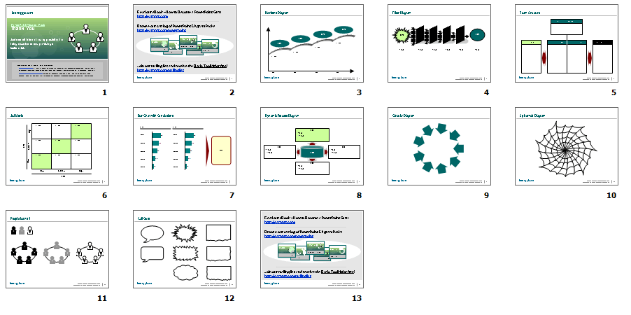
Here’s a screenshot of what’s included:

And, if you haven’t yet, be sure to also download the Basic PowerPoint Toolkit.  This is another free download and includes 15+ slides of PowerPoint diagrams, shapes, templates, charts, tables, and icons.

For pre-made PowerPoint diagrams used in business presentations and other powerpointing needs, browse our library here: learnppt.com/powerpoint/.  These diagrams were professionally designed by management consultants. Give your presentations the look and feel of a final product made by McKinsey, BCG, Bain, Booz Allen, Deloitte, or any of the top consulting firms.

Slide from Scratch: Process Optimization Presentation

In this example, we will build a set of slides that capture a process optimization initiative.  The slides will be following the Consulting Presentation Framework, where we start the slide with a Headline message and close with the Bumper.  The bumper captures the key takeaway or added insight of the slide.

The Premise

Here’s our hypothetical situation. After evaluating financial ratios and comparables, your company realizes its operations are very inefficient.  In particular, management recognizes that its core financial processes are poorly executed in their current states. They have asked you and your team to analyze and optimize the processes of forecasting, accruing, and financial reporting. These three processes are sequential.

The purpose of the business presentation we will create is to capture the results of your process optimization initiative. (As an aside, process optimization is a cost reduction effort.) For each process, we will provide an overview, lay out the inputs and outputs, as well as draw out the proposed future state process flow. This presentation should act as a report management can print out, review, as well as distribute to others in the organization.

The Thought Process

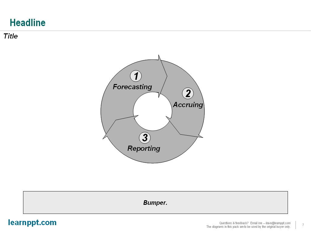
To begin, we should have a vision in mind for a diagram that is both intuitive and aesthetically appealing. Since we are looking at 3 sequential processes that repeat on a monthly, ongoing basis, let us create a circular approach diagram. This is the diagram I am referring to:
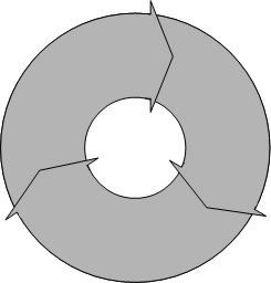
Remember how to create that?  If not, just take a refresher at this tutorial: Circular Approach PowerPoint Diagram.  The only downside this method of constructing circular approach diagrams is that you can’t individually select and format the chevrons.  You won’t have that problem with the Circular Approach Diagrams here though.  This is a great pack of editable PowerPoint diagrams that includes both Circular Approach and Force Diagrams (PowerPoint Templates).

Now, slap this diagram onto a slide and add in some text. For each segment, we want to add a label (e.g. “Forecasting”) and a number to illustrate proper sequence.
We would like to add more clarity around what each process represents. To do this, we can add this explanatory text to the right of the diagram. At this point, we can also complete the slide, adding in our Header and Bumper texts. Let’s see how the final slide looks.
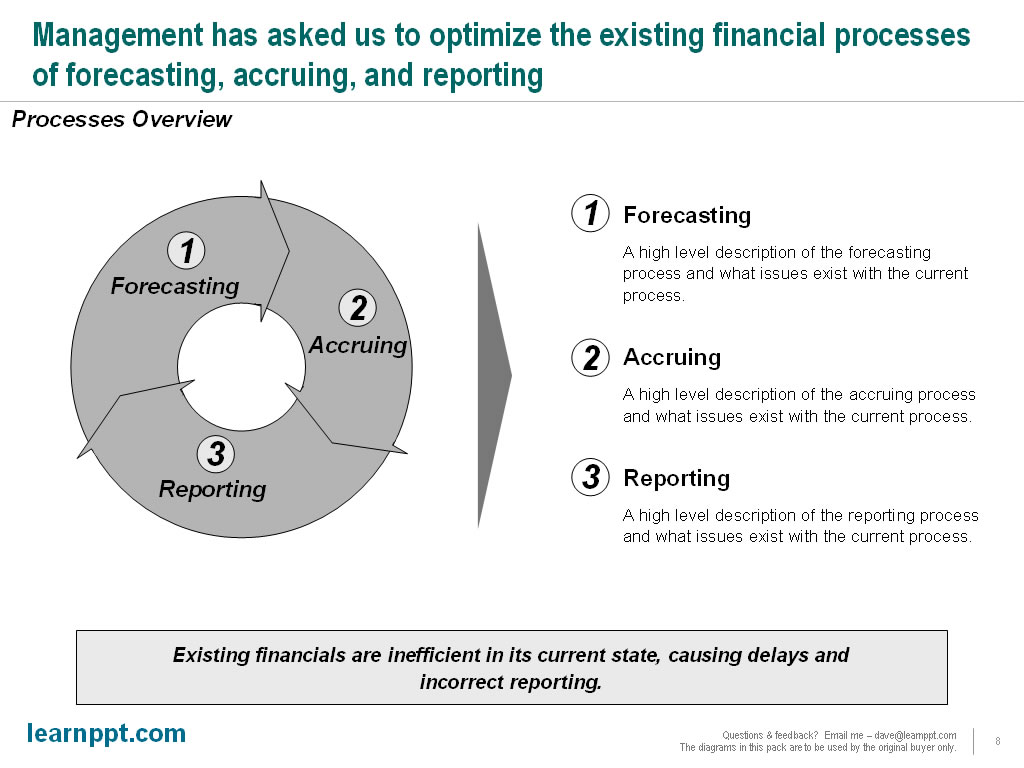
Again, the text content used is illustrative and largely for purposes to fill the slide. The “bumper” text (see Consulting Presentation Framework section for a refresher on this term) captures an insight that is not obvious from the rest of the slide.

One other important observation to make is that this diagram is also very simple. Because of its simplicity, it will make a good “tracker” to be used on future slides. A tracker is an icon diagram used on multiple slides to help the audience track along the progress of the presentation. The tracker is always a smaller version of a diagram introduced earlier in the presentation. It is usually located on the top-right portion of the slide. Hard to envisage? You’ll see soon enough.

Introducing the SIPOC Framework

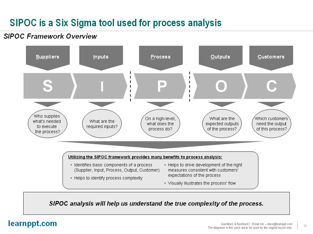
SIPOC is a tool used in Six Sigma to evaluated processes and identify touch points between process steps. It is an acronym, standing for Suppliers, Inputs, Process, Outputs, and Customers. You can learn more about the SIPOC framework at iSixSigma.com and OpensourceSixSigma.com. SIPOC also provides a great PowerPoint template for breaking down a process.

We will create an initial slide to introduce the SIPOC concept and diagram. We will begin by creating a chevron-diagram, where each chevron AutoShape represents one of the components of S-I-P-O-C. Since the focus is on the “process” of SIPOC, we will draw special attention to that in our diagram. Let’s put these initials onto a slide.
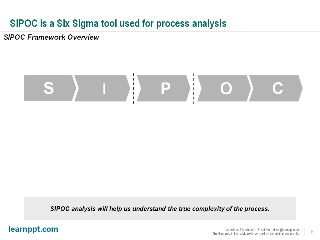
For those unfamiliar with SIPOC, we will need to explain what each letter represents. We can do this by adding downward pointing chevron AutoShapes above the current diagram. Let’s take a look.

Next, let’s add more clarity around each of the terms. What does it mean to be a supplier? How about a customer? These basic questions should be addressed on a high-level, minimally. We will do so using arrows and circles below the chevrons.

Finally, we should explain the benefits and usefulness of SIPOC analysis. This can be done at the bottom of our diagram, resulting in our completed slide. Note how the flow of the diagram it top-down. In creating a larger diagram or visual, such as this one, it is best to always have a flow of information. This helps guide the audience.
Creating the Process-specific Slides

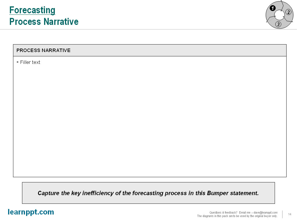
We will create a set of slides for each of the 3 processes. Within the set, the first slide will be the “Process Narrative.” This slide presents an overview of the process, explaining what it is, what are the issues and inefficiencies, and the recommended improvements to the existing process.

The next slide will be our SIPOC analysis for the process. This will break down the process in a more structure format.

The final slide will be the proposed future state process flow. This slide will contain a process flow diagram, illustrating each of the process steps or activities, how they sequence, and who or what performs each step.

We will be using the “tracker” icon across all our slides. This tracker will be based off the circular approach diagram created in the overview slide. Let’s see how the tracker will look on the Process Narrative slide for the Forecasting process.

Since our narrative is essentially all text, all we need is a text box. Instead of using a plain text box, in our example, we will use a table with 2 rows. The top row will be our heading. The second row will contain the bulk of our content. Since our example is just for illustrative purposes, I won’t bother filling up this slide with text.
Now, we will create the SIPOC slide. As the audience is already familiar with the S-I-P-O-C chevron diagram, we will re-use it here. Let’s copy and paste this diagram to the top of the body. Under it, we will create a table with 2 primary rows. The first row will explain the purpose of the element. The second row tabulates specific examples, as they relate to the forecasting process.
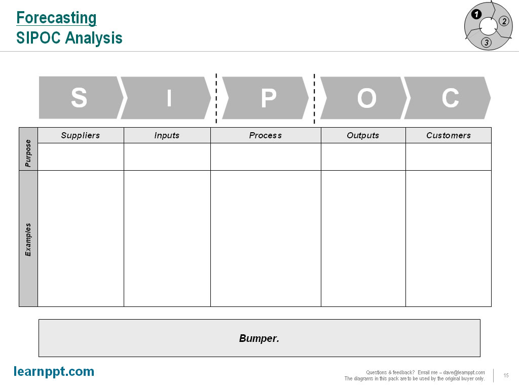
Note how the entire bottom half of the diagram was created using a table. To create the vertically-oriented text, i.e. “Examples” and “Purpose,” I created a text box and rotated it 90 degrees. Now, let’s fill out the table with text.
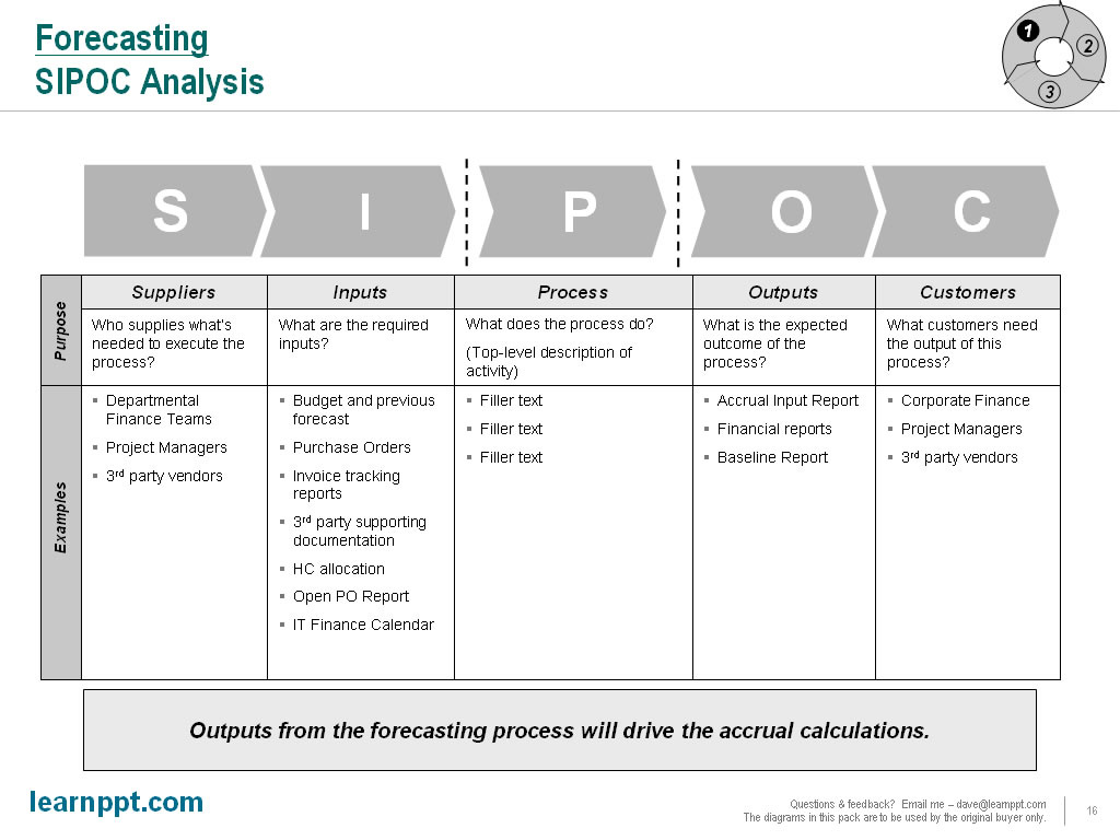
Note that our examples are listed using indented bullets. I also like to create paragraph spacing between the bullets. This gives everything a clean, organized look.

Lastly, we will create the future state process flow slide.   Remember how to create a process flow in PowerPoint?  If not, take a look at this Slide from Scratch tutorial: A Billing/Invoicing Process Flow.

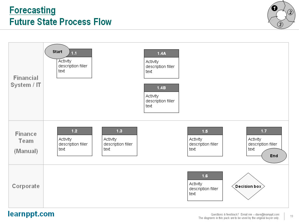
Remember, I like to organize my process flows with simple, high-level swim lanes.  Depending on the nature of your process, you are free to define your swim lanes however you’d like. In our example, we will define them as “Financial System/IT,” “Finance Team (Manual),” “Corporate.” I will create the swim lanes using a table in PowerPoint. Here we go.
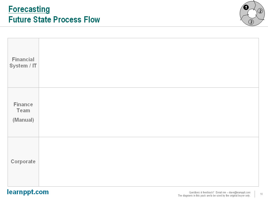
Time to lay out our process flow shapes. A process flow can be very complex. So, it is important to lay things out in a very organized way. Don’t bother putting in any lines yet. Do that after you’re happy with the layout of all your shapes.
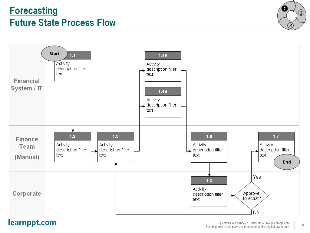
Once you’ve laid out your process steps, we can connect them using the Elbow Arrow Connector AutoShape to form the finalized process flow diagram.
A process flow diagram can be an overwhelming visual for your audience to digest. Therefore, you may want to highlight specific swim lanes and specific process steps. To highlight a swim lane, merely shade the background. This is easy to do, since our swim lanes were created using a table. To highlight specific steps, just use a call out boxes (which are AutoShapes). Let’s have a look.
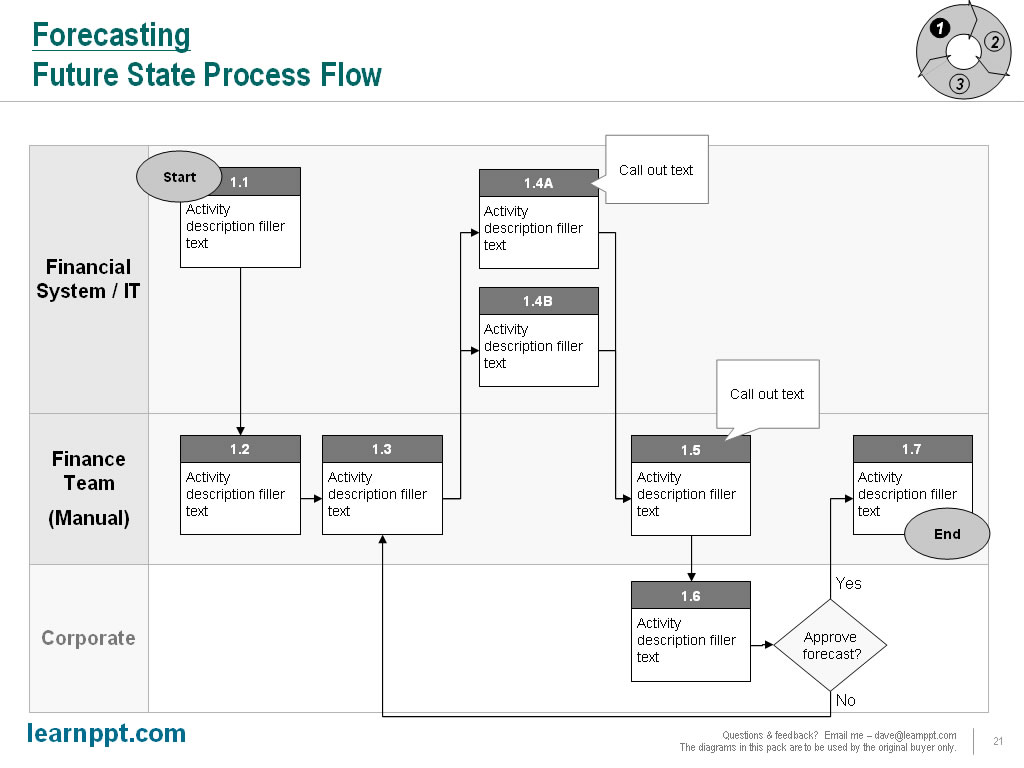
There we go.  If you’d like, you can further enhance your process flow diagrams with these specialized PowerPoint diagram packs:

Those are are our set of 3 slides for the Forecasting process. We just need to copy and paste these slides for the Accruing and Reporting sections. I will leave that exercise for you. Just remember to update the tracker diagram for these other processes. To make each process section more comprehensive, you can add in these additional slides: a current state process flow, a slide outlining key metrics and performance indicators, a slide tabulating process objectives, a slide listing assumptions used, and a slide capturing any outstanding questions.

You can download this full presentation (with the intermediate slides) here: Process Optimization Presentation ( http://learnppt.com/downloads/process-optimization/).

You can also download a free PowerPoint plugin called Flevy Tools that creates commonly used consulting diagrams: http://flevy.com/powerpoint-plugin.  Flevy Tools allows you to dynamically generate Gantt Charts, Harvey Ball diagrams, approach diagrams, and other diagrams.  For the time being, it’s a completely free download.

Questions, thoughts, concerns?  Go to my site (learnppt.com) and shoot me an email.  On my site, you will find information about my recent eBook, Become a PowerPoint Guru, which teaches how to create effective business presentations (from structuring your story to designing your diagrams).

For pre-made PowerPoint diagrams used in business presentations, browse our library here: learnppt.com/powerpoint/.  These diagrams were professionally designed by management consultants. Give your presentations the look and feel of a final product made by McKinsey, BCG, Bain, Booz Allen, Deloitte, or any of the top consulting firms.
Slide from Scratch: Business Strategy Update Presentation

In this installation of the Slide from Scratch, we’ll create 3 slides that will go into a Business Strategy Update Presentation.  The slides will be following the Consulting Presentation Framework, where we start the slide with a Headline message and close with the Bumper.  The bumper captures the key takeaway or added insight of the slide.

The Premise

So, here’s our hypothetical situation. Our company has already defined its strategic vision and corresponding goals for the fiscal year. Its corporate strategy has been published and communicated out to the organization. As such, business units have defined specific strategic initiatives, supporting the company’s strategy and goals, and have begun executing them.

The purpose of the business presentation we will create is to capture the business unit-level initiatives and status of these initiatives. Let’s say there are four key business units that management is most interested in: Sales & Marketing, Finance, Supply Chain, and International Business. This presentation should act as a report management can print out, review, as well as distribute to others in the organization.

The Thought Process

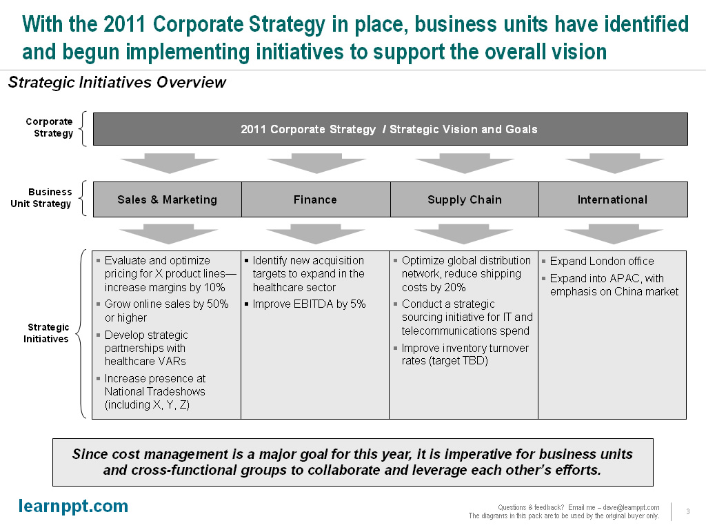
To begin, we should have a vision in mind for a diagram that is both intuitive and comprehensive. Since strategy is driven down from the corporate level, let us create a diagram with a layered effect. An easy way to do this is just to create horizontal layers (e.g. Rectangle AutoShape, tables) separated by a series of downward pointing arrows (to illustrate the top-down flow). We’ll create 3 layers, labeled Corporate Strategy, Business Unit Strategy, and Strategic Initiatives. This illustrates that the overarching Corporate Strategy defines the Business Unit-level Strategy, which then define the Strategic Initiatives at the operational level.

Slide Design: The Strategy Update Overview Slide

Based on our thought process, let’s lay out the first iteration of our slide.

Note that for the Business Unit and Strategic Initiative layers, I’ve split each into 4 columns. This is because we will focus only on the 4 business units that management expressed the most interest in: Sales & Marketing, Finance, Supply Chain, and International Business. The top layer is created with a normal Rectangle AutoShape, while the other 2 4-columned layers are created using tables.

Now, let’s fill out the text.

Again, the text is all hypothetical and filler. For the strategic initiatives, I am using indented bullets with a space between paragraphs. This makes each initiative easier to read. The “bumper” text (see Consulting Presentation Framework section for a refresher on this term) captures an insight that is not obvious from the rest of the slide.

One other important observation to make is that this diagram is also very simple. Because of its simplicity, it will also make a good “tracker” to be used on future slides.  The tracker is a technique we introduced in the last Slide from Series 3-Prong Marketing Strategy article.  As a reminder, a tracker is an icon diagram used on multiple slides to help the audience track along the progress of the presentation. The tracker is always a smaller version of a diagram introduced earlier in the presentation. It is usually located on the top-right portion of the slide.  We’ll use trackers in the next 2 slide creation walk throughs.

Slide Design: Business Unit Scorecard Slides

Next, in the presentation, we want to create a series of slides that report on the statuses of the strategic initiatives. We will create 1 slide per business unit for each of the 4 main business units. Let’s call each slide a scorecard.

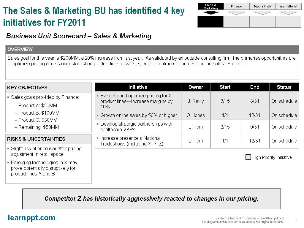
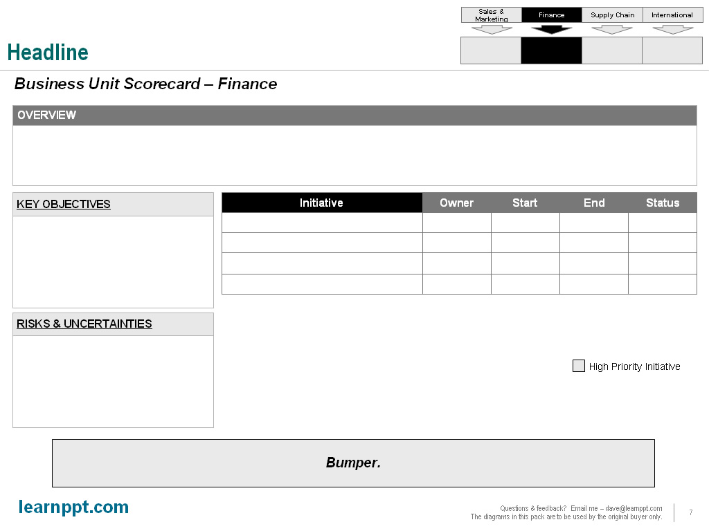
Each scorecard will contain 4 key sections: an overview explaining the business unit-level strategy and goals, the list of initiatives with details (e.g. owner, status), a list of key objectives, and any identified risks or uncertainties.

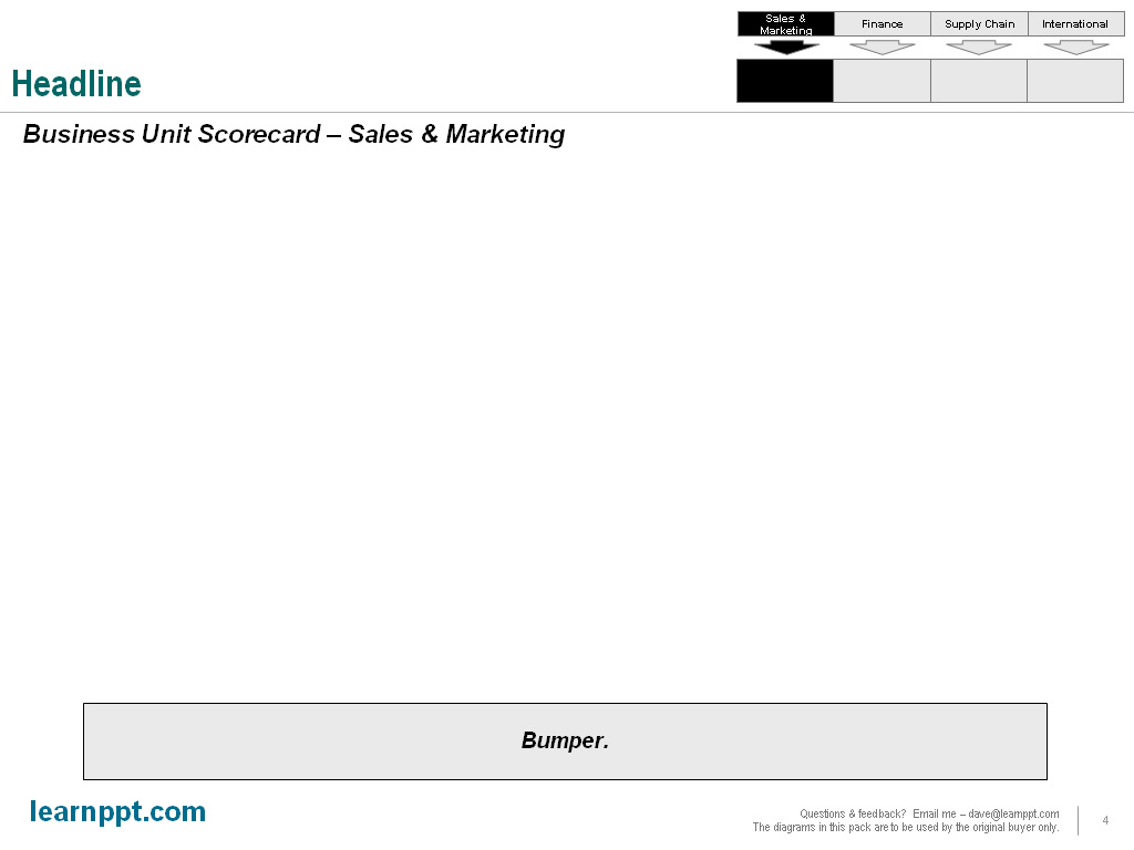
First, let’s drop in that tracker. The tracker will just be the 2 lower layers of the diagram in the overview slide, shrunken down. We will pop this in the top-right portion of the slide and highlight (i.e. shade in with a darker color) the appropriate columns. In other words, for the “Sales & Marketing” scorecard, we will highlight the first column in the tracker diagram.

Here, let’s have a look.

The easiest way to make a scorecard or scorecard-like slide is with tables. In our example, we will create it entirely out of tables. We will create 1 table per section. To maintain a professional and high-quality look, make sure to align the sections properly. Resize whenever you need to. Leave equal spacing between sections as well as around the margins. Remember, a nicely formatted slide is a cue for high quality.

Here’s what we have now without any text yet.

Now, let’s add in the meat of the content.

Note that I added the embellishment of highlighting those initiatives that are considered high priority. Color coding rows is easy and intuitive. You can also additional colors for low priority and medium priority. Remember to always use a legend, like I have (under the initiative table).

Another embellishment that you can also add is to color code the cells under the “status” column. For instance, if the initiative is “On schedule,” color that cell green. If it’s behind schedule, color it red. I didn’t bother to do this in our example.

Once you have one scorecard created, you can replicate this for the 3 other business units. Remember to update the highlighting of the tracker for each slide.

Here’s what the Finance slide would look like with the updated tracker PowerPoint diagram.

Slide Design: Shared Services Scorecard Slide

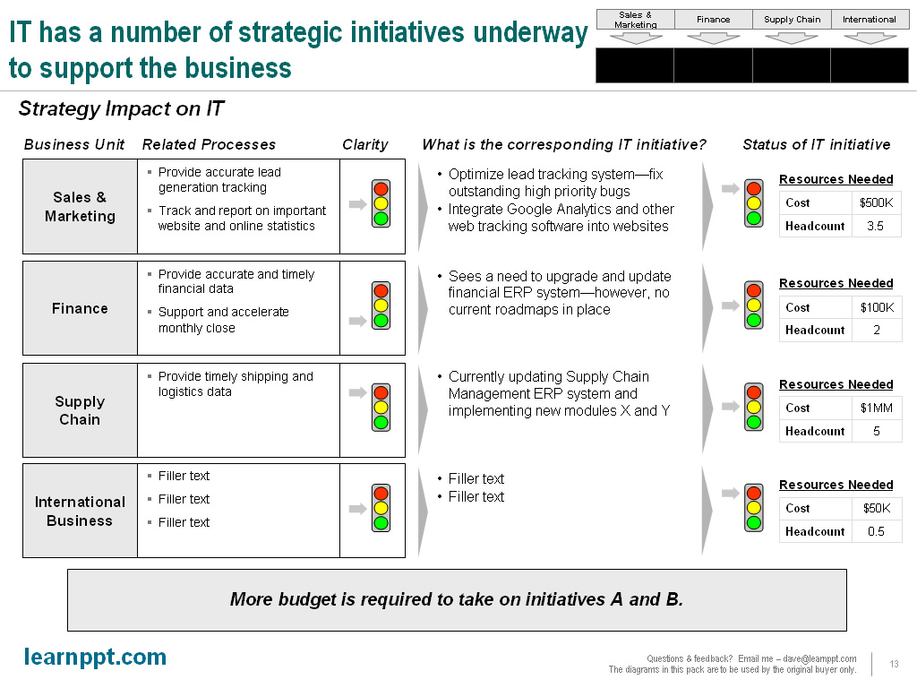
Now, let’s take this one step further. We also need report on the status of supporting initiatives from important cross-functional, shared services. Let’s take IT as an example. To support many of the strategic initiatives of our primary 4 business units, IT will need to install or upgrade new technologies.

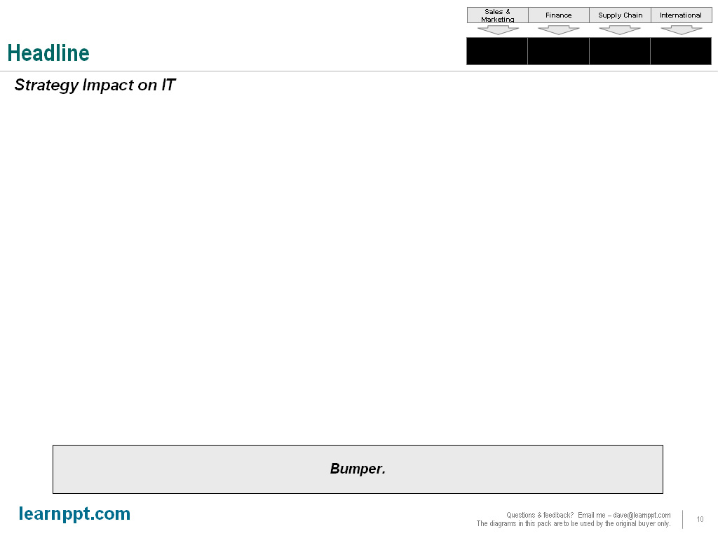
For a shared services business unit, we will design a new type of scorecard layout. We can still leverage the tracker icon. However, instead of highlighting vertically, we can highlight horizontally to illustrate the cross-functional nature of this business unit. In the case for IT, we will highlight all 4 business units.

Here, let’s have a look at the updated tracker.

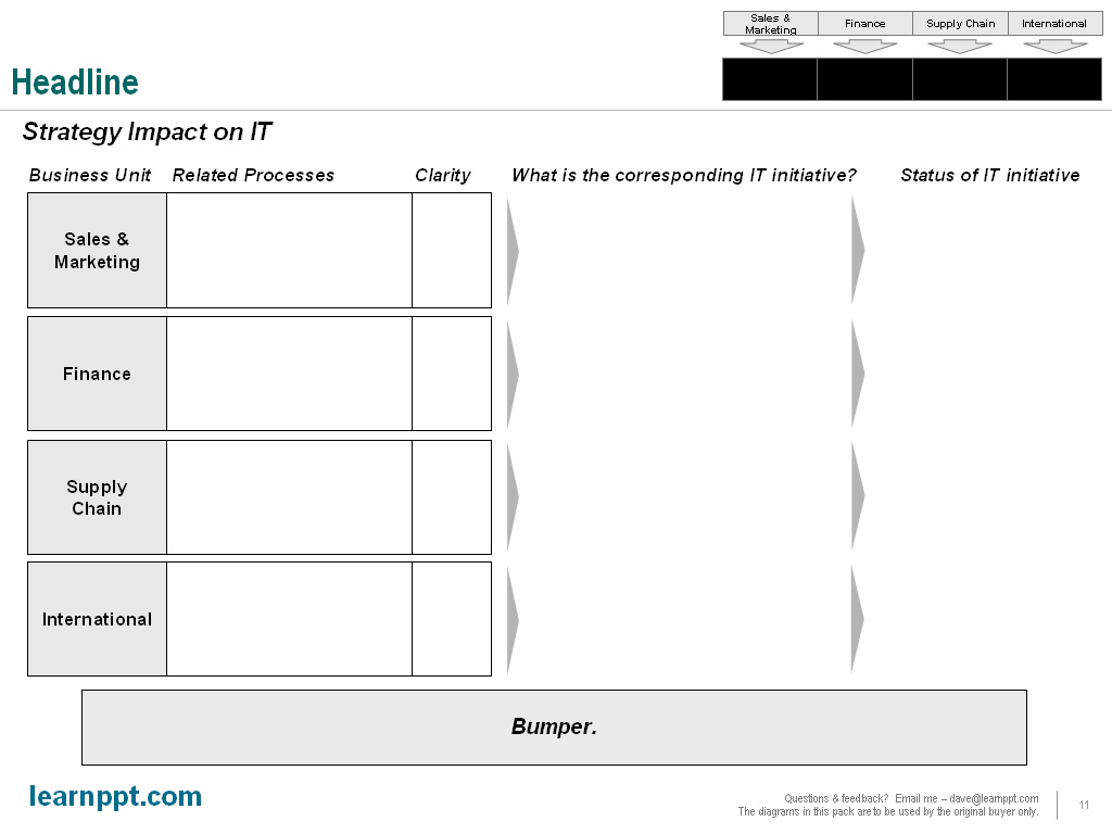
For this scorecard, we will stick to a structured matrix layout. Since we need to illustrate IT’s impact on 4 business units, we will create 4 rows in our matrix layout. Each row corresponds to a business unit.

Our columns will represent various components that we would like to capture. In this example, we will capture the following components: related business unit processes; clarity of process to IT; corresponding IT initiatives; and status of IT initiatives.

Here’s how our matrix diagram looks.

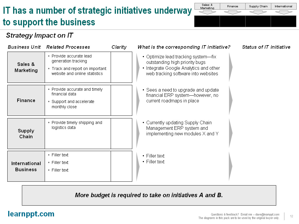
Now, let’s fill in some text.

The slide, as you may have noticed, isn’t complete yet. For the “Clarity” and “Status of IT initiative” columns, we can use traffic light icons. These diagrams are very popular with executives, since they’re simple and very intuitive. I have even had clients specifically request this type of diagram after seeing them used. I try to utilize them in my PowerPoint slides whenever I need to illustrate the status of anything. Of course, since Kindle diagrams appear in shades of grey, it’s not as effective here.

Under “Status of It initiative,” we will also capture resource requirements. This can be done in a small 2×2 table. Let’s take a look at the finished slide.

Alright, there we go!  These slides can easily be customized to fit a different organization, one with different primary and supporting business units.  You can download all these slides for free at LearnPPT:  http://learnppt.com/downloads/strategy-update/.

If your work involves or are just interested in corporate strategy development, I recommend checking out our Strategy Development Toolkit.  It’s a fairly detailed 37-slide PowerPoint with topics covering key learnings borrowed from historical military strategists to the modern fundamentals of strategy development.  It also describes a 3-phase approach used by top management consultants when conducting a strategy development engagement.

You can download a free PowerPoint plugin called Flevy Tools that creates commonly used consulting diagrams: http://flevy.com/powerpoint-plugin.  Flevy Tools allows you to dynamically generate Gantt Charts, Harvey Ball diagrams, approach diagrams, and other diagrams.  For the time being, it’s a completely free download.

Questions, thoughts, concerns?  Go to my site (learnppt.com) and shoot me an email.  On my site, you will find information about my recent eBook, Become a PowerPoint Guru, which teaches how to create effective business presentations (from structuring your story to designing your diagrams).

For pre-made PowerPoint diagrams used in business presentations, browse our library here: learnppt.com/powerpoint/.  These diagrams were professionally designed by management consultants. Give your presentations the look and feel of a final product made by McKinsey, BCG, Bain, Booz Allen, Deloitte, or any of the top consulting firms.

Free Agenda and Transition Slide Template

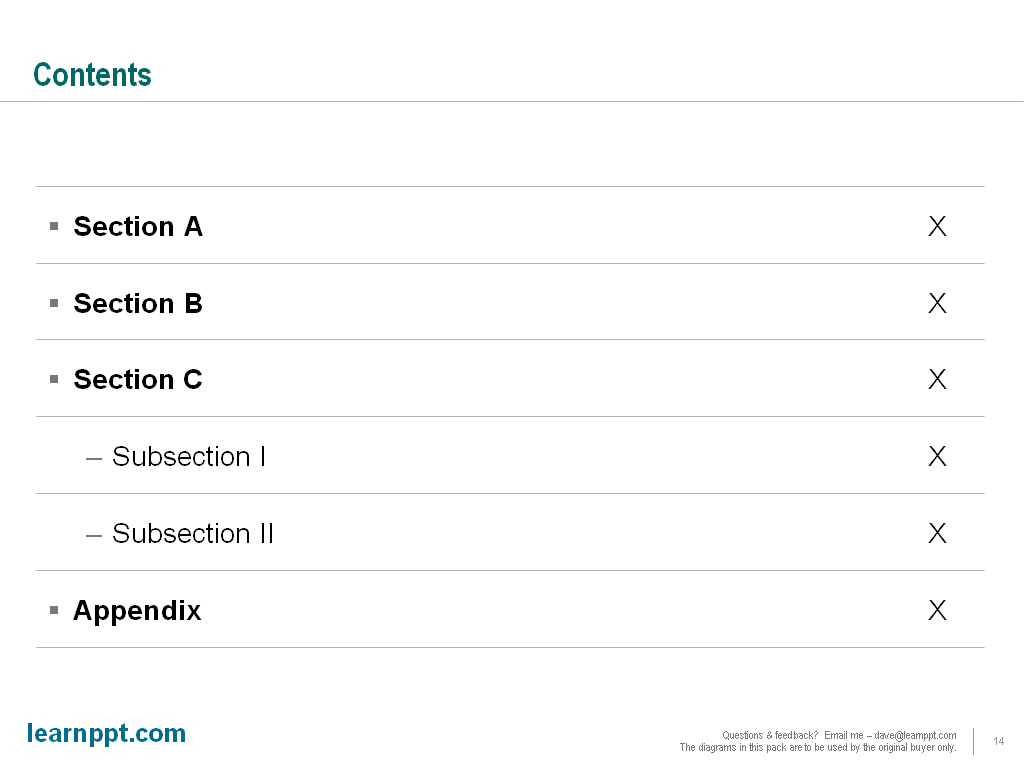
In most presentations, you will have an Agenda or Contents slide at the start of your document.  This slide provides an overview of what will be included in the document, serving as a table of contents.

I use a very simple and clean style in creating this slide.  Have a look.


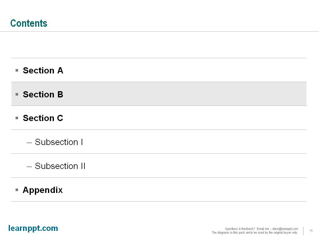
This diagram itself is just a 1 column table.  Each row represents a section.  I like to use bullets.  For the subsections, I indent the row and change the bullet.  Page numbers can be added to the far right of each row using tabs.

I then leverage this exact slide to use as separator or transition slides.  Here’s an example.

You can download this PowerPoint template for free here (http://learnppt.com/downloads/agenda-contents/). Enjoy.

You can also download a free PowerPoint plugin called Flevy Tools that creates commonly used consulting diagrams: http://flevy.com/powerpoint-plugin.  Flevy Tools allows you to dynamically generate Gantt Charts, Harvey Ball diagrams, approach diagrams, and other diagrams.  For the time being, it’s a completely free download.

Questions, thoughts, concerns?  Go to my site (learnppt.com) and shoot me an email.

For pre-made PowerPoint templates used in business presentations, browse our library here: learnppt.com/powerpoint/.  These diagrams were professionally designed by management consultants. Give your presentations the look and feel of a final product made by McKinsey, BCG, Bain, Booz Allen, Deloitte, or any of the top consulting firms.

PowerPointing – How to Create a Cone Diagram

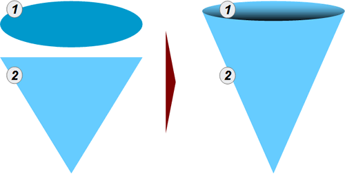
One of the easiest diagrams to create is the Cone Diagram. In fact, it’s just the piecing together of 2 shapes: a triangle (for the body) and a circle (for the opening).  Just see below.

To enhance the look of the circular opening, I like to change the background color fill of the circle using a linear gradient.

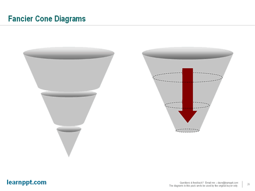
Similar to the PowerPoint funnel diagram, a cone diagram is a great tool to illustrate a downselection or filtering down process.   Likewise, you can also easily build upon the cone diagram to show added layers and direction of flow.  See the examples below.

You can download all the cone diagrams shown in this PowerPoint tutorial here (http://learnppt.com/downloads/cone_diagrams/).  Enjoy.

You can also download a free PowerPoint plugin called Flevy Tools that creates commonly used consulting diagrams: http://flevy.com/powerpoint-plugin.  Flevy Tools allows you to dynamically generate Gantt Charts, Harvey Ball diagrams, approach diagrams, and other diagrams.  For the time being, it’s a completely free download.

Questions, thoughts, concerns?  Go to my site (learnppt.com) and shoot me an email.

For pre-made PowerPoint templates used in business presentations, browse our library here: learnppt.com/powerpoint/.  These diagrams were professionally designed by management consultants. Give your presentations the look and feel of a final product made by McKinsey, BCG, Bain, Booz Allen, Deloitte, or any of the top consulting firms.

http://powerpointing-templates.com/2010/07/how-to-create-a-funnel-diagram-in-powerpoint/

Cost Reduction Toolkit is Discounted through Sunday

Through this Sunday, learnPPT is having a promo for the Cost Reduction Toolkit.  This detailed document identifies over 45+ cost cutting initiatives across the Value Chain.  For each initiative, examples are provided, along with projected potential savings.

The Cost Management opportunities are broken down into the areas of:

  • Enterprise-wide – These opportunities are cross-functional, meaning they can affect multiple functions within an organization.  The impact is largely to SG&A costs.
  • Asset Management – These opportunities target the improvement of fixed assets efficiency and decreasing net working capital.  The impact is largely capital efficiency.
  • Function-specific – Opportunities in this category are specific to primary and support functional activities.  These are operational and transactional in nature.

This toolkit also explains the levers and challenges to profitability, as well as the formula identifying cost reduction opportunities.

Here’s a partial preview of the PowerPoint presentation.

Questions, thoughts, concerns?  Go to my site (learnppt.com) and shoot me an email.

For pre-made PowerPoint diagrams used in business presentations and other powerpointing needs, browse our library here: learnppt.com/powerpoint/.  These diagrams were professionally designed by management consultants. Give your presentations the look and feel of a final product made by McKinsey, BCG, Bain, Booz Allen, Deloitte, or any of the top consulting firms.

Free Decision Tree PowerPoint Template

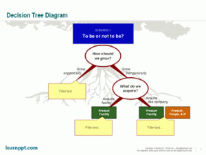
For a current consulting engagement, we prepared a presentation for the management team to brainstorm various growth strategy options.   To facilitate this discussion, we created a decision tree diagram outlining the key decision points and the most viable options pivoting from each decision point.

I wanted to make this diagram especially intuitive.  So, I embedded an image of a tree with deep roots (that I found off Google Image) as backdrop to the slide.  See below.

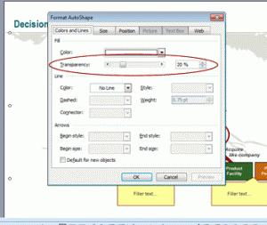
To create this backdrop/watermark effect, I used a very simple technique.  After finding an appropriate image, I merely copied it into the slide and placed it behind a large white rectangle.  I then set the transparency of the white rectangle to 20% (under the ‘Format AutoShape’ properties window).  The transparent white box grayed out the image into the background.

If you would like to use this decision tree diagram in your business presentation, I’ve made it available for download here: Decision Tree PowerPoint template.  I realize I make a lot of one-time throw-away slides.  Might as well make them available for download on this site, right? 🙂

By the way, you can download a free PowerPoint plugin called Flevy Tools that creates commonly used consulting diagrams here: http://flevy.com/powerpoint-plugin.  Flevy Tools allows you to dynamically generate Gantt Charts, Harvey Ball diagrams, approach diagrams, and other diagrams.  For the time being, it’s a completely free download.

Questions, thoughts, concerns?  Go to my site (learnppt.com) and shoot me an email.

For pre-made PowerPoint diagrams used in business presentations and other powerpointing needs, browse our library here: learnppt.com/powerpoint/.  These diagrams were professionally designed by management consultants. Give your presentations the look and feel of a final product made by McKinsey, BCG, Bain, Booz Allen, Deloitte, or any of the top consulting firms.