 Become a PowerPoint Guru by Dave Tracy
Learn the methodologies, frameworks, and tricks used by Management Consultants to create executive presentations in the business world.
Become a PowerPoint Guru by Dave Tracy
Here is a compilation of the free PowerPoint documents we’ve made available through the course of 2011.
Holiday Gift PowerPoint Toolkit
http://learnppt.com/downloads/holiday-gift/
Here is a collection of 20+ PowerPoint diagrams, templates, and charts, originally created as a holiday gift to LearnPPT’s newsletter subscribers.
Process Optimization Presentation
http://learnppt.com/downloads/process-optimization/
This is a process optimization presentation. It is the accompanying download for this PowerPoint tutorial:
http://powerpointing-templates.com/2011/10/slide-from-scratch-process-optimization-presentation/
Business Strategy Update Presentation
http://learnppt.com/downloads/strategy-update/
This is a presentation showing a business strategy update. It is the accompanying download for this PowerPoint tutorial:
http://powerpointing-templates.com/2011/09/business-strategy-update-presentation/
Agenda and Transition Slide Template
http://learnppt.com/downloads/agenda-contents/
This is a simple, clean, table-based template used for creating the agenda slide and transition slides.
Cone Diagrams
http://learnppt.com/downloads/cone_diagrams/
This is a set of cone diagrams. Creating a cone diagram yourself is simple, as illustrated by the accompanying tutorial:
http://powerpointing-templates.com/2011/06/powerpointing-how-to-create-a-cone-diagram/
Decision Tree Template
http://learnppt.com/downloads/decision-tree-powerpoint-template/
This is a fancy looking decision tree diagram/template. It was created originally for a client slide that was scrapped. You can modify it to include additional decision points and outcomes.
Diamond Diagram
http://learnppt.com/downloads/diamonds/
This is a set of diamond diagrams of various segments. It is created using the built-in Radar charts, as illustrated in the accompanying tutorial:
http://powerpointing-templates.com/2011/02/powerpointing-how-to-create-a-diamond-diagram/
Want to add more free PowerPoints to your collection? Check out our free PowerPoint downloads of 2010 (26 in all last year):
http://powerpointing-templates.com/2010/12/free-powerpoint-downloads-of-2010/
Thanks for reading our blog!
Questions, thoughts, concerns? Go to my site (learnppt.com) and shoot me an email.
For pre-made PowerPoint diagrams used in business presentations and other powerpointing needs, browse our library here: learnppt.com/powerpoint/. These diagrams were professionally designed by management consultants. Give your presentations the look and feel of a final product made by McKinsey, BCG, Bain, Booz Allen, Deloitte, or any of the top consulting firms.
One of the easiest diagrams to create is the Cone Diagram. In fact, it’s just the piecing together of 2 shapes: a triangle (for the body) and a circle (for the opening). Just see below.

To enhance the look of the circular opening, I like to change the background color fill of the circle using a linear gradient.
Similar to the PowerPoint funnel diagram, a cone diagram is a great tool to illustrate a downselection or filtering down process. Likewise, you can also easily build upon the cone diagram to show added layers and direction of flow. See the examples below.

You can download all the cone diagrams shown in this PowerPoint tutorial here (http://learnppt.com/downloads/cone_diagrams/). Enjoy.
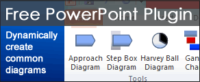
You can also download a free PowerPoint plugin called Flevy Tools that creates commonly used consulting diagrams: http://flevy.com/powerpoint-plugin. Flevy Tools allows you to dynamically generate Gantt Charts, Harvey Ball diagrams, approach diagrams, and other diagrams. For the time being, it’s a completely free download.
Questions, thoughts, concerns? Go to my site (learnppt.com) and shoot me an email.
For pre-made PowerPoint templates used in business presentations, browse our library here: learnppt.com/powerpoint/. These diagrams were professionally designed by management consultants. Give your presentations the look and feel of a final product made by McKinsey, BCG, Bain, Booz Allen, Deloitte, or any of the top consulting firms.
Through this Sunday, learnPPT is having a promo for the Cost Reduction Toolkit. This detailed document identifies over 45+ cost cutting initiatives across the Value Chain. For each initiative, examples are provided, along with projected potential savings.
The Cost Management opportunities are broken down into the areas of:
This toolkit also explains the levers and challenges to profitability, as well as the formula identifying cost reduction opportunities.
Here’s a partial preview of the PowerPoint presentation.
Questions, thoughts, concerns? Go to my site (learnppt.com) and shoot me an email.
For pre-made PowerPoint diagrams used in business presentations and other powerpointing needs, browse our library here: learnppt.com/powerpoint/. These diagrams were professionally designed by management consultants. Give your presentations the look and feel of a final product made by McKinsey, BCG, Bain, Booz Allen, Deloitte, or any of the top consulting firms.
For a current consulting engagement, we prepared a presentation for the management team to brainstorm various growth strategy options. To facilitate this discussion, we created a decision tree diagram outlining the key decision points and the most viable options pivoting from each decision point.
I wanted to make this diagram especially intuitive. So, I embedded an image of a tree with deep roots (that I found off Google Image) as backdrop to the slide. See below.

To create this backdrop/watermark effect, I used a very simple technique. After finding an appropriate image, I merely copied it into the slide and placed it behind a large white rectangle. I then set the transparency of the white rectangle to 20% (under the ‘Format AutoShape’ properties window). The transparent white box grayed out the image into the background.

If you would like to use this decision tree diagram in your business presentation, I’ve made it available for download here: Decision Tree PowerPoint template. I realize I make a lot of one-time throw-away slides. Might as well make them available for download on this site, right? ![]()
By the way, you can download a free PowerPoint plugin called Flevy Tools that creates commonly used consulting diagrams here: http://flevy.com/powerpoint-plugin. Flevy Tools allows you to dynamically generate Gantt Charts, Harvey Ball diagrams, approach diagrams, and other diagrams. For the time being, it’s a completely free download.
Questions, thoughts, concerns? Go to my site (learnppt.com) and shoot me an email.
For pre-made PowerPoint diagrams used in business presentations and other powerpointing needs, browse our library here: learnppt.com/powerpoint/. These diagrams were professionally designed by management consultants. Give your presentations the look and feel of a final product made by McKinsey, BCG, Bain, Booz Allen, Deloitte, or any of the top consulting firms.
A diamond diagram or a segment diagram is a very useful and flexible diagram. You can use them to illustrate anything that has multiple contributing components. The powerpointing technique taught in this tutorial is a great one to have in your growing PowerPoint diagramming skill set.
Here are some examples of situations that can be intuitively portrayed using diamond diagrams:
Now, there’s an incredibly easy way to create a Diamond Diagram in PowerPoint!
First, create a chart in PowerPoint and change the ‘Chart Type’ to ‘Radar Chart.’

Next, modify the chart values. First, only leave 2 rows of data. Then, create as many columns as you would like segments. In our example, we will create a diamond with 5 segments. For the first row, set all the values to 1. For the second, set all the values to 2. UPDATE – The screenshot below is from PowerPoint 2003. For PowerPoint 2007 and 2010, the datasheet format is vertical–not horizontal (like you see in the image below). Therefore, you must input your values vertically (i.e. 1s and 2s in the same columns, not rows)

Next, change the line color for both of the data lines to black. Then, format the chart such that you remove the axis labels and set both the major and minor units to 1.
Your chart should now look like this. We pretty much have it.

I’m going to do some formatting, including replacing the inner section with a Pentagon AutoShape.
There we have it — a quick and easy powerpointing trick to create a Diamond or Segment Diagram using Radar Charts in PowerPoint.

Here are a couple more Diamond Diagrams with a different number of sides:

You can download the above slides from LearnPPT @ http://learnppt.com/downloads/diamonds/
If you are looking a larger variety of Segment Powerpoint templates, pre-built and ready to use, check out the Relationship, Segment, and Network Diagrams PowerPoint Pack:
http://learnppt.com/powerpoint/13_Relationship%2C-Segment%2C-%26-Network-Diagrams.php
Also, you can download a free PowerPoint plugin called Flevy Tools that creates commonly used consulting diagrams here: http://flevy.com/powerpoint-plugin. Flevy Tools allows you to dynamically generate Gantt Charts, Harvey Ball diagrams, approach diagrams, and other diagrams. For the time being, it’s a completely free download.
Questions, thoughts, concerns? Go to my site (learnppt.com) and shoot me an email.
For pre-made PowerPoint diagrams used in business presentations and other powerpointing needs, browse our library here: learnppt.com/powerpoint/. These diagrams were professionally designed by management consultants. Give your presentations the look and feel of a final product made by McKinsey, BCG, Bain, Booz Allen, Deloitte, or any of the top consulting firms.
A couple more days and we’re done with 2010. Hope everyone has had a memorable and successful year.
This year marked the launch of both this blog and its parent PowerPoint resource site, Learn PowerPoint. This blog post is a recap of all free ppt downloads that have been made available through both of these sources.
Enjoy!
1-19. Free PowerPoint Templates
In 2010, we created 19 PowerPoint templates made available for free downloads. These have been our most downloaded free PowerPoints and span across a wide array of industries, including medical, technology, and business, to name a few.
Become a PowerPoint Guru book support materials
Become a PowerPoint Guru is a guide around creating effective business presentations using techniques and methodologies developed by consulting firms, like McKinsey, BCG, and Bain. The focus is very similar to that of this blog, e.g. powerpointing tricks, slide design, PowerPoint chart usages, etc.
Miscellaneous PowerPoint Diagrams and PowerPoint Templates
The links below are to pre-built PowerPoints that have largely been created in supported of our blog posts, many from our powerpointing tutorials.
22. Marketing Strategy PowerPoint Templates
Download – http://learnppt.com/downloads/3prongstrategy/
Tutorial – http://powerpointing-templates.com/2010/07/slide-from-scratch-3-prong-marketing-strategy/
23. Funnel Diagrams in PowerPoint
Download – http://learnppt.com/downloads/funnel_diagrams/
Tutorial – http://powerpointing-templates.com/2010/07/how-to-create-a-funnel-diagram-in-powerpoint/
24. Project Charter PowerPoint Template
Download – http://learnppt.com/downloads/project_charter/
Tutorial – http://powerpointing-templates.com/2010/11/the-blueprint-for-projects-success-a-project-charter/
25. PowerPoint Waterfall Chart Diagrams
Download – http://learnppt.com/downloads/waterfallcharts/
Tutorial – http://powerpointing-templates.com/2010/12/powerpointing-how-to-create-a-waterfall-chart-in-powerpoint/
26. Consulting Presentation Framework Template
Download – http://learnppt.com/downloads/sampletemplate/
Tutorial – http://ezinearticles.com/?The-Management-Consulting-Presentation-Framework&id=4423363
Expect more free PowerPoint diagrams and templates to come in 2011. Thanks for reading!
Questions, thoughts, concerns? Go to my site (learnppt.com) and shoot me an email.
For pre-made PowerPoint diagrams used in business presentations and other powerpointing needs, browse our library here: learnppt.com/powerpoint/. These diagrams were professionally designed by management consultants. Give your presentations the look and feel of a final product made by McKinsey, BCG, Bain, Booz Allen, Deloitte, or any of the top consulting firms.
The Waterfall Chart is one of the most effective and intuitive ways to illustrate change. It shows the total change, along with a breakdown of the individual components that have driven this change. Typically, it is used to represent a financial change — e.g. YoY changes in sales.
WaterFall Charts aren’t part of PowerPoint default selection of Chart Types. However, we can easily create one using a Stacked Column Chart.
Here’s how.
Start with create a generic chart in PowerPoint. Add enough data points and label them to your needs. In the example below, we’ll create a Waterfall Chart showing YoY Sales Growth. Observe the x-axis labels. ‘A,’ ‘B,’ and ‘C’ will later be our component bars.

Next, we want to make some quick adjustments to this chart. Change the ‘Chart Type’ to ‘Stacked Column.’
Also, adjust the ‘Gap width’ between the bars to be minimal (e.g. 10). Note that ‘Gap width’ is found under the ‘Options’ tab within the ‘Format Data Series’ window.
Remove one of the data sets, so we are only left with 2 stacked columns.

Now, to create the “waterfall” illusion, color the lower/bottom column with “no fill.” This lower column will determine how elevated the bar is from the x-axis.
Adjust your numbers as needed to create your Waterfall Diagram. I recommend removing the extraneous chart features, as well, e.g. grid lines, legend, etc.

I like to ungroup my chart, so I have more flexibility and control over the look and feel. Oftentimes, different colored bars are used and dashed lines are added to accentuate the change.

Here’s a fancier example.

You can download all the PowerPoint Waterfall Charts used in this PowerPointing tutorial from learnPPT:
http://learnppt.com/downloads/waterfallcharts/
To learn more about different types of charts, a very comprehensive resource is the Become a PowerPoint Guru book. It details and explains appropriate chart usage across the wide array of different types of data composition (e.g. item comparison, time series, frequency, correlation, etc.).
You can also download a free PowerPoint plugin called Flevy Tools that creates commonly used consulting diagrams here: http://flevy.com/powerpoint-plugin. Flevy Tools allows you to dynamically generate Gantt Charts, Harvey Ball diagrams, approach diagrams, and other diagrams. For the time being, it’s a completely free download.
Questions, thoughts, concerns? Go to my site (learnppt.com) and shoot me an email.
For pre-made PowerPoint diagrams used in business presentations and other powerpointing needs, browse our library here: learnppt.com/powerpoint/. These diagrams were professionally designed by management consultants. Give your presentations the look and feel of a final product made by McKinsey, BCG, Bain, Booz Allen, Deloitte, or any of the top consulting firms.
To learn more about different types of charts, a very
comprehensive resource is my the Become a PowerPoint Guru book.
It details chart uses across the wide array of different types
of data composition (e.g. item comparison, time series,
frequency, correlation, etc.).